| Image |
Comment |
| 11/11/2003 02:56:18 PM |
A Basket of Mumsby SharonSComment: nice! love the composition. good dof and lighting. great focus. the sepia, really gives the mums an interesting feel. |
 Photographer found comment helpful. Photographer found comment helpful. |
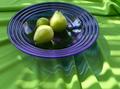
| 11/11/2003 02:54:58 PM |
Green on Blue on Greenby sonasandComment: nice color use. love the interesting effects and patterns caused by the reflections , the ripples and the plate. given the cropping, perhaps having the bottom folds of the table cloth at more of a diagonal would 'lead' one into the picture more. |
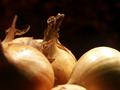
| 11/11/2003 02:52:40 PM |
Onionsby kinksComment: nice soft lighting. i think this would be stronger if all objects were in focus, esp since the foreground objects take up so much space, and the focused onion is obstructed so much. |
| Photographer found comment helpful. |
| 11/11/2003 02:50:42 PM |
Denver Broncosby evmariedogsComment: i think this would have been stronger if it was not a profile shot, but rotated a bit more. lighting could also be softened. |
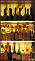
| 11/11/2003 02:48:22 PM |
The Top Shelfby aKiwiComment: could use more sharpness/focus. i like the warm feel created by the light glowing in the back. |
| Photographer found comment helpful. |
| 11/11/2003 02:46:14 PM |
I swear, he didn't move!by SoulHunter74Comment: hahah. it almost looks like he's in one of those cushy walled white rooms. he just needs one of those white straight jackets...hehe. the background feels a bit too overexposed. given that he sits in corner, seeing the lines leading in would have helped the composition a little. |
| Photographer found comment helpful. |
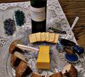
| 11/11/2003 02:44:29 PM |
Wine and Cheese with other "snacks"by GrandmaEMTComment: this is definitely a still life, but the composition and set up is not the best. strange angle and cropping (perhaps a more vertical crop including the wine and the bread would have helped a little), as well as badly lit and not well focused. could have used a different angle, more sharpness, and less busy subject (no focal point). |
| Photographer found comment helpful. |
| 11/06/2003 12:57:05 AM |
|
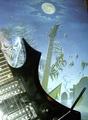
| 11/06/2003 12:55:52 AM |
Tidbit!by tolovemoonComment: would have been strengthened had lighting been better placed. perhaps using something to soften the glare on the guitar. |
| Photographer found comment helpful. |
| 11/06/2003 12:54:50 AM |
|
Home -
Challenges -
Community -
League -
Photos -
Cameras -
Lenses -
Learn -
Help -
Terms of Use -
Privacy -
Top ^
DPChallenge, and website content and design, Copyright © 2001-2025 Challenging Technologies, LLC.
All digital photo copyrights belong to the photographers and may not be used without permission.
Current Server Time: 08/21/2025 08:51:19 AM EDT.