| Image |
Comment |
| 03/07/2008 02:40:39 AM |
|
| 03/07/2008 02:39:21 AM |
"Houses of the Holy"by XMountaineerComment: Nice color. But overall I find the image uninteresting. It's just a photo of a church but nothing to draw me in or move me. |
 Photographer found comment helpful. Photographer found comment helpful. |
| 03/07/2008 02:37:34 AM |
|
| Photographer found comment helpful. |
| 03/07/2008 02:34:13 AM |
Tea for Oneby NordlysComment: Really like the color of the tea. The highlight on the tea really makes it jump out, perhaps too much compared to the rest of the image. It causes the back of the cup and the handle to really stand out from the front of the cup and the tea pot. |
| Photographer found comment helpful. |
| 03/07/2008 02:32:09 AM |
|
| Photographer found comment helpful. |
| 03/07/2008 02:30:55 AM |
I Can't Quit You Babyby spistoleComment: Interesting concept. Don't really care for the high key look and the washed out colors. Might be better as a pure B/W image. |
| Photographer found comment helpful. |
| 03/07/2008 02:29:24 AM |
|
| Photographer found comment helpful. |
| 03/06/2008 10:05:39 PM |
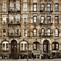
Houses Of The Holy by pawdrixComment: The color and lighting is great on the buildings. Really like the tone. The person is a little dark and doesn't stand out enough against the building background. Also don't care for the way the person is past the halfway point and appears to be walking out of the photo. |
| Photographer found comment helpful. |
| 03/06/2008 10:04:01 PM |
|
| Photographer found comment helpful. |
| 03/06/2008 10:02:36 PM |
Dazed and Confusedby jprezantComment: Nice concept. I like the capture of the smoke. The DOF works well. Would like to see a the guy be a little better lit and so much in shadow. |
| Photographer found comment helpful. |
Home -
Challenges -
Community -
League -
Photos -
Cameras -
Lenses -
Learn -
Help -
Terms of Use -
Privacy -
Top ^
DPChallenge, and website content and design, Copyright © 2001-2025 Challenging Technologies, LLC.
All digital photo copyrights belong to the photographers and may not be used without permission.
Current Server Time: 08/28/2025 03:49:15 PM EDT.