| Image |
Comment |
| 04/01/2004 11:02:48 PM |
Nature at workby neenee1999Comment: Looks like your attempt to brighten and sharpen this led to a bit too heavy dose of the NeatImage that washed away some important details of the flowers and left the background to bright. |
 Photographer found comment helpful. Photographer found comment helpful. |
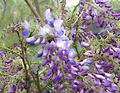
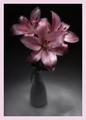
| 04/01/2004 11:00:42 PM |
Orchidby bormicComment: The flower is very interesteing thought I think both it and the background could have used a little boost in saturation. Really like the patterns of the background but they might have been less defined as your composition of the flower, which I like, leaves me a bit disoriented when I look past it. |
| Photographer found comment helpful. |
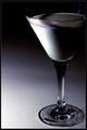
| 04/01/2004 10:53:09 PM |
Got Milk?by eostylesComment: I liked your attempt to light this, but, for my feeling, more of the white of the milk in the glass should be showing. I find it a bit too dark in the majoritiy. |
| Photographer found comment helpful. |
| 04/01/2004 10:51:54 PM |
Fat & Sassyby scrum8Comment: Now does the title describe the squirrel on your frame....it's a toss up! Overall shot of the squirrel is oK b except you might have done something about the "Y" twig crossing the end of that great tail. The DOF is great. I'm so so about the composition....the tree branch is fine but Ithink the squirrel's position on it a bit too centered. OVerall I like it...except of course, the frame. |
| Photographer found comment helpful. |
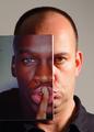
| 04/01/2004 01:01:43 AM |
Split Personalityby johnmComment: My first thought that this was very good and then I thought I wish the finger of the of the bacground model might have been place over the finger in the picture....and then I saw the little bit of text on the picture which may DQ it although I will not recommend myself cause I really like this otherwise.....I'll let the anals do it....don't won't to ruin their fun. |
| Photographer found comment helpful. |
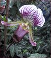
| 04/01/2004 12:57:34 AM |
Allegrettoby FranziskaLangComment: Oooh,very pretty and I like the softness of this very much, Franziska....but the frame has GOT to go, or at least some or most if not all of it. The color is fine I just think it is too much, it distracts and maybe is a bit too powerful in size for the delicacy of your flower image. |
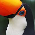
| 04/01/2004 12:54:22 AM |
Toucan Candid by kirbicComment: perfect detail, composition, exposure....The DOF is good, but the background might have been a bit brighter as its color and shade do not accentuate the birds iamge at all. Otherwise great shot! |
| Photographer found comment helpful. |
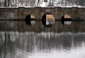
| 04/01/2004 12:52:10 AM |
Foot Bridgeby OlyuziComment: more woods, less reflection, though I like reflections the lower bw area of reflections is too much....a good crop using the thirds might help this but it seems to lack enough color to really give it any wow quality. The bridge looks the best in this image and more emphasis might have been place on it. |
| Photographer found comment helpful. |
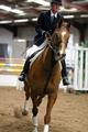
| 04/01/2004 12:49:35 AM |
Show Jumpingby PaulMdxComment: THe quality of the subject shot is quite fine, good exposure, the cropping of the top of the riders head and the front legs of the the horse really mars this. |
| Photographer found comment helpful. |
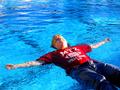
| 03/31/2004 02:02:29 AM |
Fat Man Floatingby toadtheprinceComment: nothing out of place about that...none of us like to take our clothes off in public for any reason and we float Real Good....lots of ballast.! |
| Photographer found comment helpful. |
Home -
Challenges -
Community -
League -
Photos -
Cameras -
Lenses -
Learn -
Help -
Terms of Use -
Privacy -
Top ^
DPChallenge, and website content and design, Copyright © 2001-2025 Challenging Technologies, LLC.
All digital photo copyrights belong to the photographers and may not be used without permission.
Current Server Time: 08/14/2025 08:50:49 AM EDT.