| Image |
Comment |
| 04/03/2004 12:54:15 AM |
|
 Photographer found comment helpful. Photographer found comment helpful. |
| 04/03/2004 12:53:17 AM |
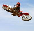
Everything Turns Gray at 160mph…by HomunculusComment: The focus appears to be off on the cycle. the lower portion of the background does not quite work for me and I wonder if a little select desate on hte yellow would have made that area a little less distracting. |
| 04/03/2004 12:51:34 AM |
I see you...by tfaustComment: Great Composition of the cyclist and the bike. I'm wondering, based, on your title, it the amount of air time or negative space you used is necessary. Great capture, Timing and detail |
| Photographer found comment helpful. |
| 04/03/2004 12:49:31 AM |
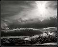
Mountain Light by dsidwellComment: My interests lay in the lower half of this image wiithe clouds skirting the finely lit mountains....the source of the lighting and the top half I am not thrilled with but It is damn fine none the less. |
| Photographer found comment helpful. |
| 04/03/2004 12:43:51 AM |
Cute Little Pussy Catby browntComment: I appreciate the effort this takes, people and animals ar beyound me for now. But I think that this image needed a lot of post to get it to this state which, though i Could easily be wrong....It just is not as crisp and natural looking as I would like it to be. |
| Photographer found comment helpful. |
| 04/01/2004 11:19:41 PM |
Self Centeredby crabappl3Comment: Like the tones and texture contrasts....the chair is just a bit off center from the center line of the flooring (the spine of the back of the chair is just left (mine) of the center line of the floor). otherwise very nice.7 |
| Photographer found comment helpful. |
| 04/01/2004 11:11:58 PM |
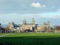
Dutch Museum at Duskby rodneygComment: too much dark forground and sky and not enought museum. This would make a great panorama if you can do it....my pano shots suck so I understand if you are not up to it. The architecture appears very nice and somewhat colorful and I would like a close look at it. |
| Photographer found comment helpful. |
| 04/01/2004 11:10:01 PM |
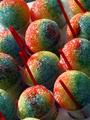
Slurpiesby RtwoComment: Like the colors and the repeated shapes. I wish the straws were in the same position in each cop cause their color is great and it would have added to the shot for me. Also a little judicious cropping might be in order for the bottom and to lose the edge of the table at top. Think this would work great with a little more work if opportunity presents, a better angle if reshot. |
| Photographer found comment helpful. |
| 04/01/2004 11:06:58 PM |
|
| Photographer found comment helpful. |
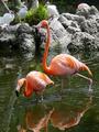
| 04/01/2004 11:06:21 PM |
Flamingo Reflectionsby LindavComment: Were you at the IberoStar Tucan in Playa del Carmen? Shame you couldn't get closer to get a clear shot of this....I tried myself in Nov. and mine were pretty bad ....you just couldn't get close enough to take a decent shot....your angle and nearness to the subjects are better but the shot is way off focus wise, as were mine. |
Home -
Challenges -
Community -
League -
Photos -
Cameras -
Lenses -
Learn -
Help -
Terms of Use -
Privacy -
Top ^
DPChallenge, and website content and design, Copyright © 2001-2025 Challenging Technologies, LLC.
All digital photo copyrights belong to the photographers and may not be used without permission.
Current Server Time: 08/14/2025 01:57:18 AM EDT.