| Image |
Comment |
| 04/29/2002 01:23:00 PM |
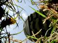
a quiet dayby lecookComment: On preview I thought the ball was an Easter egg. I like the misty texture and saturated greens. Is the ball a little out of focus? |
| 04/29/2002 08:36:00 AM |
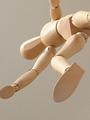
Wooden Mannequinby RemieComment: The lighting is pretty nice and the figure really feels like it's in action, jumping off a wall or something. I do wish that the fraction of the hand on the left side wasn't cropped out, and I wonder why it looks so grainy? |
| 04/29/2002 09:33:00 AM |
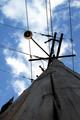
Power Linesby AndyLeeG4Comment: Nice sky. Did you try rotating the picture so that the vertical lines on the right were parallel to the side of the frame? |
| 04/29/2002 09:20:00 AM |
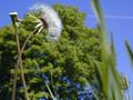
Blowin' in the Windby risu81Comment: I like the composition and nice bright blue sky. The airplane line on the background is unfortunate. |
| 04/30/2002 11:48:00 AM |
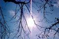
The sun in all its gloryby ohsmomComment: You'll ruin your eyes looking straight at the sun like that :-) Was the pinkish cast there, or is that some sort of lens effect comparable to what happens to your eyes when you do that? |
| 04/30/2002 07:29:00 AM |
|
| 05/02/2002 08:52:00 AM |
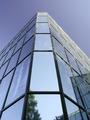
Building Of Reflectionsby D-ManComment: The trees in the front panel and the reflection of the building off to the side sort of spoil the symmetry. It's a nice subject for this challenge though. |
| 04/30/2002 10:50:00 AM |
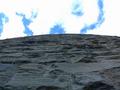
The Sky's The Limitby midnight442Comment: Good texture in the wall. I wonder if by framing it vertically, you could have composed it so that the line between wall and sky was not so close to the middle of the picture - "rule of thirds". |
| 05/03/2002 02:04:00 PM |
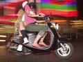
Nice day!....Oh Sh.....by vin rigbyComment: Cute. Well exposed, I think. The lighting on the bottom of the book works well to emphasize its texture, as well as that of the grass. You could easily have ended up with a blown out or completely white sky, but it looks pretty good. |
| 04/29/2002 07:52:00 AM |
Spirit of Saint Louisby insipidangelComment: The burned out dials really work, as well as the high contrast and sparse but bright colors. It's just to ever-so-slightly off-center as to seem like a mistake though - I might have liked it better had it been exactly symmetrical or more off-center. |
Home -
Challenges -
Community -
League -
Photos -
Cameras -
Lenses -
Learn -
Help -
Terms of Use -
Privacy -
Top ^
DPChallenge, and website content and design, Copyright © 2001-2025 Challenging Technologies, LLC.
All digital photo copyrights belong to the photographers and may not be used without permission.
Current Server Time: 08/25/2025 05:32:15 PM EDT.