| Image |
Comment |
| 04/29/2002 02:14:00 PM |
|
| 04/30/2002 07:07:00 AM |
Glenkiln Crossby AnAUTigerComment: Good exposure on the cross. Sky is a bit white, but that was probably unavoidable. How big is this? It's hard to tell a sense of scale..I'm wondering if something else in the foreground other than the grass, or maybe a less straight-ahead angle would make this picture more interesting. |
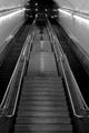
| 04/29/2002 09:46:00 AM |
The Longest Mileby CoreyComment: Cool how the escalators blurred in the long exposure. I don't know what the light and dark triangles up the stairs are, but I like them. Would it have been possible to catch the top of the arch of the tunnel? Well done. |
 Photographer found comment helpful. Photographer found comment helpful. |
| 05/01/2002 08:46:00 AM |
Stella By Sunlightby PauloComment: Cute doggie. Nice colors and natural light. I think maybe if the dog had been less centered...maybe if the tree were not 'attached' to her head, but if there were some space between them... |
| 04/30/2002 08:16:00 AM |
Waiting to be free...by fsieradzkiComment: The sky is a nice blue (where do you live that you don't have clouds!?) and the backlighting on the dandelion gives it a nice effect. I think if you had framed it vertically and shielded the lens to avoid that lens flare, it would have been stronger. |
| 04/29/2002 04:40:00 PM |
|
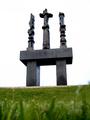
| 04/29/2002 12:22:00 PM |
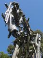
Whoa Horsyby debcardComment: I don't know what this is..some sort of sculpture? Rather nicely done, but it seems like the trees in the background take away from it being immediately apparent the detail in the wooden thing, because the green doesn't contrast enough with the wood. |
| 04/29/2002 11:16:00 AM |
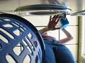
Spin Cycleby connieComment: Not a very flattering picture of the woman, but I really like the pattern of the laundry basket along with the pattern of the ceiling tiles. What I don't like is the reflection of the woman's face in the very top (I think it spoils the kind of 'any-woman' feeling of it) and the window on the right doesn't add much. |
| 05/01/2002 09:08:00 AM |
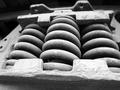
Together We Stand, Divided We Fallby akcoffeeguyComment: Not sure what those are. They look like really big springs. The tonal range is nice...but I wish you hadn't cut off the right side, and I think a little more depth of field so that the top of whatever-that-is was in focus would improve it. |
| 04/29/2002 07:50:00 AM |
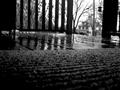
asunderby lauComment: I like the reflections of the railing in the wet deck boards. It works quite well in black and white. The fact that the right side of the opening is not parallel to the edge of the frame or to the telephone pole bothers me a bit though. Is it like that in 'real life'? |
Home -
Challenges -
Community -
League -
Photos -
Cameras -
Lenses -
Learn -
Help -
Terms of Use -
Privacy -
Top ^
DPChallenge, and website content and design, Copyright © 2001-2025 Challenging Technologies, LLC.
All digital photo copyrights belong to the photographers and may not be used without permission.
Current Server Time: 08/25/2025 08:25:10 PM EDT.