| Image |
Comment |
| 05/30/2002 08:26:00 AM |
|
| 05/30/2002 07:01:00 PM |
Month End Madnessby zerplordComment: The white balance may be a little off. But it looks like there was a huge variety of lighting colors, so that would be extremely difficult, if not impossible, to get right. My attention gets pulled to the guy in the striped shirt, which I'm not sure is a good thing, since it seems like this photo should be more about the crowd than that guy. You definitely made a well composed photograph out of a chaotic scene though. |
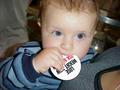
| 05/29/2002 01:53:00 PM |
Small Wonderby welcherComment: By your unusual choice of focus, it seems like the viewer's attention is supposed to be drawn to that hand. While it's an original idea, I'm not sure it's successful, since I'm still drawn much more to the face. I think it might be because the blanket is obscuring some of the baby's hand...it would have worked better with a more visible hand, I think. |
| 05/29/2002 02:34:00 PM |
Hydrabad Princessby bruster54Comment: I think a more contrasting background would have made this picture stand out a bit more. Her dress and her skin tones are in the yellow range, so a blue or red background I think would have made them pop out some more. |
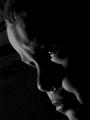
| 05/30/2002 06:48:00 PM |
The Pouterby jmsetzlerComment: Nice use of negative space. I think maybe I could have been happier with a little more detail, a little less dark. The darkness definitely gives it a mood, but I think as it is it strikes me as more menacing than pouting. |
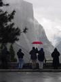
| 05/29/2002 01:57:00 PM |
Yosemite Diehardsby debcardComment: I like the red umbrella. I wonder how it would have looked with the blue even more desaturated, to make those blue pants a little greyer, and pull the emphasis more towards the umbrella. Alternatively, I wonder if you could crop out the parking lot, and the girl on the left and most of that tree, leaving the umbrella on the left side of the picture. |
| 05/29/2002 01:34:00 PM |
Liftoffby eesserComment: Neat action shot...why is he jumping and why is it tilted? Those questions come to mind first for me, but I do think that it's a nice relatively uncluttered, out of focus background and an interesting moment. |
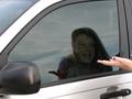
| 05/29/2002 02:24:00 PM |
Give me the Keys!by BNCComment: Interesting superimposition of faces, and I like how I can see the keys inside the car. Not so crazy about the little tiny fingertips on the right side though. |
| 05/29/2002 02:32:00 PM |
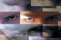
Eye Variationsby hokieComment: I will be waiting to see how you did this. I'm sure if sounds pretty snooty...but it really looks so much like a digitally manipulated photo montage type of thing, that even if it isn't, I'm not sure how much I like it as a photograph. Maybe I'm just sore that I couldn't do this though. |
| 05/30/2002 07:01:00 AM |
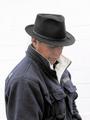
Band Managerby jimmspComment: I like the white background. The expression is pretty interesting, too. |
Home -
Challenges -
Community -
League -
Photos -
Cameras -
Lenses -
Learn -
Help -
Terms of Use -
Privacy -
Top ^
DPChallenge, and website content and design, Copyright © 2001-2025 Challenging Technologies, LLC.
All digital photo copyrights belong to the photographers and may not be used without permission.
Current Server Time: 08/26/2025 08:23:05 AM EDT.