| Image |
Comment |
| 05/30/2005 06:29:01 PM |
Spice Bowlsby radharamComment: I like the idea here a lot - showing the different textures in the containers. but I think the execution could be improved. the simple plastic bowls aren't very attractive, the background is bland and the crop is poor. If you had, for example, lined up the bowls carefully and cropped so that each had exactly 1/4 of the bowl in each corner, it would have provided more visual punch. |
 Photographer found comment helpful. Photographer found comment helpful. |
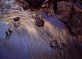
| 05/26/2005 12:12:36 AM |
Wineby jmooreComment: very well done. I love the swirls of color and the texture and shape of the liquid. |
| 05/25/2005 11:39:30 PM |
|
| Photographer found comment helpful. |
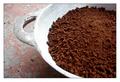
| 05/25/2005 11:30:05 PM |
coffee grainsby cjavierComment: nice texure and composition. the bowl's highlights are slightly blown out, but it's a nice composition overall. |
| Photographer found comment helpful. |
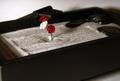
| 05/25/2005 11:29:00 PM |
Granular Gardenby BlackDotComment: I think this was a good subject but would have been more interesting cropped in tighter to focus on the and patterns and the flower. |
| Photographer found comment helpful. |
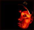
| 05/24/2005 12:29:54 AM |
"Thought by Firelight"by tfarrell23Comment: I like the lighting a lot, but not the color cast. The hot spot on his cheek and around his eye is somewhat distracting too. |
| Photographer found comment helpful. |
| 05/24/2005 12:26:38 AM |
Dark Angelby irikaComment: interesting lighting and point of view. she seems a bit underexposed. also, I wish her foot wasn't cropped off |
| 05/23/2005 07:30:54 AM |
The Oracleby arngrimurComment: I love the lighting and the sharpness here, but there are several things that bother me about this image - her hands look unnaturally huge, and her leg that is in the foreground looks uncomfortable. I would prefer that she was gazing into the "oracle" or looking more directly into the camera - as it is, she looks half asleep. |
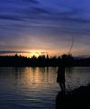
| 05/22/2005 02:36:07 PM |
LaCamas Lakeby ace flymanComment: this would have been great if the camera was positioned lower, so that the silouette of the fisherman was not lost amid the treeline. still a nice image, but could have been better |
| Photographer found comment helpful. |
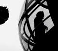
| 05/22/2005 02:33:54 PM |
Eye Glassby MatthewComment: I think it would have been a good idea to crop out the object on the left |
| Photographer found comment helpful. |
Home -
Challenges -
Community -
League -
Photos -
Cameras -
Lenses -
Learn -
Help -
Terms of Use -
Privacy -
Top ^
DPChallenge, and website content and design, Copyright © 2001-2025 Challenging Technologies, LLC.
All digital photo copyrights belong to the photographers and may not be used without permission.
Current Server Time: 08/14/2025 08:12:10 AM EDT.