| Image |
Comment |
| 07/08/2009 04:10:39 PM |
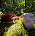
A few of my favorite shoesby leematthewsComment: The range in light makes for a little distraction here and maybe to many subjects to focus on. I like the outdoor setting but softer light will def help here |
 Photographer found comment helpful. Photographer found comment helpful. |
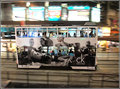
| 07/04/2009 03:45:50 AM |
Spam in my Glassby ksnymanComment: A sharp image well exposed. Colours work for me. The glass being slightly of to the right Makes the pic a bit unbalanced for me. The biggest thing I would like to have seen different here is the idea which I assume you tried to create here, with letters in the background, distorted and obscured by the curve of the glass, to be sharp as well. At the moment it's to distant and is difficult to bring spam as the main theme into the picture |
| Photographer found comment helpful. |
| 06/28/2009 02:12:52 PM |
Steppin' Outby LonniComment: Creative and well lit shot. Simple uncluttered makes this a class shot for me |
| Photographer found comment helpful. |
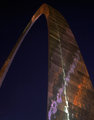
| 06/28/2009 02:11:11 PM |
The Gateway Archby SuttonNComment: Lovely image. Im really thinking that it needs more depth and sharpness at the front.Overall soft and dont know what the cause could be of this? I would have rated it much higer was it not for this |
| Photographer found comment helpful. |
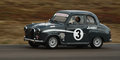
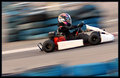
| 06/24/2009 01:42:27 PM |
Old but not Coldby ksnymanComment: Nice shot here with good effort on the panning of the car. I think it could do with a little boost on the levels and exposure. This little jumbo seems to be reallymoving fast with the rims blured nicely to add to that effect. Curious to see sutter speed at the end. |
| Photographer found comment helpful. |
| 06/19/2009 01:35:49 PM |
|
| Photographer found comment helpful. |
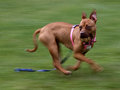
| 06/19/2009 01:33:54 PM |
CKby TiberiusComment: Ashot with punch and i love this. Pity about background not having more blur but this is still great. |
| Photographer found comment helpful. |
| 06/19/2009 01:28:47 PM |
|
| Photographer found comment helpful. |
| 06/17/2009 02:56:48 PM |
|
| Photographer found comment helpful. |
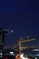
| 06/17/2009 02:19:59 PM |
More construction for less trafficeby ksnymanComment: Kosie. I like what you did with this shot where you have the tight crop of lines at the bottom created with the cars lights as well as depth created by the construction brought into the pic on the left. The crane tells a story here and the yellow is brilliant against the dark black blue background. Starlights in lights at bottom works well I suppose created by your nice F stop. The red light at bottom left a little distracting...maybe nit picking here. The biggest negative on this pic for me in rating this as 6 and not higher is the empty space at the top. i know there was not much more to work with at the bottom and was more of a clutter. However I cant find a purpose for me in the empty space at top. Looking forward to the next challenge |
| Photographer found comment helpful. |
Home -
Challenges -
Community -
League -
Photos -
Cameras -
Lenses -
Learn -
Help -
Terms of Use -
Privacy -
Top ^
DPChallenge, and website content and design, Copyright © 2001-2025 Challenging Technologies, LLC.
All digital photo copyrights belong to the photographers and may not be used without permission.
Current Server Time: 08/24/2025 08:56:56 PM EDT.