| Image |
Comment |
| 04/23/2008 08:12:27 PM |
|
 Photographer found comment helpful. Photographer found comment helpful. |
| 04/23/2008 08:08:36 PM |
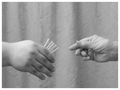
Couplingby missxmiseryComment: I think this could be a very strong image, but as submitted, I find the background very distracting. If you were to reposition the camera to the right and crop so that only the sky was visible, I think it would be greatly improved. |
| Photographer found comment helpful. |
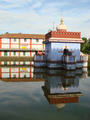
| 04/23/2008 07:56:44 PM |
Holy Waterby romilComment: I like the symmetry and the reflection; you have most of the parts of a great image here. A few minor improvements: if you had crouched down a little, then you could block out the tops of the trees that are just peeking over the top of the building at left. The shadow across the blue portion of the building is a little distracting. The overhead wire is also unfortunate; too bad you can't clone it out under the basic editing rules. |
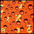
| 04/23/2008 07:45:14 PM |
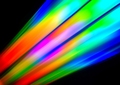
Numeric Spheres by LimboComment: Perhaps a little cliched, but I happen to like this type of image. I particularly like the choice of the orange colour. |
| Photographer found comment helpful. |
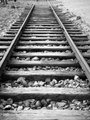
| 04/23/2008 07:40:50 PM |
Railroad of Timeby emu2008Comment: I like the shallow depth of field, but the first few ties could be sharper. I also find the bright corner at upper right is a little distracting. |
| 04/23/2008 07:38:55 PM |
Periferiaby Rino63Comment: One of my favorites in this challenge. I like the variety of shapes and the symmetries in the pair. Nicely shot. |
| Photographer found comment helpful. |
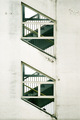
| 04/23/2008 07:36:33 PM |
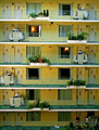
Housekeepingby eagerComment: An interesting image with the housekeeping carts and planters, but I find it just a little "cluttered" with the assorted small porch lights, electrical panels, etc, on each floor. I might also try cropping out the bottom two floors and going to a square aspect ratio on the top four floors---that might better emphasize the symmetry of the building and the alternating cart/planter aspect of the image. |
| 04/23/2008 07:29:12 PM |
Choose Carefullyby togtogComment: I find the texture/pattern of the background a little distracting. I'm also not sure how this fits into "even." |
| Photographer found comment helpful. |
| 03/12/2008 09:09:31 PM |
Pythagorian Theoremby dsmilComment: Given that the challenge was "blurry mess," with descriptors of "chaotic," "disorganized," and yet "engaging" and "interesting," I'm puzzled at what this image is trying to accomplish. The background at the right of the image is more "cluttered" than chaotic, while the subject is just blurry enough to be annoying and not blurry enough to truly meet the challenge.
I don't think this image would be particularly strong or compelling if everything were in sharp focus; the limited amount of blurring fails to improve matters any.
How could this be made better? I'm not sure this image can be modified to fit this challenge in particular, but it wouldn't hurt to simplify the composition to just the model and the blackboard. A tighter crop could help, as would adjusting the lighting to be a little softer and more appealing. If your model were to be working with a set of French curves (used in technical drawing), you might have some possibilities for the model to echo shape and line of what was on the blackboard. |
| Photographer found comment helpful. |
| 03/12/2008 08:54:41 PM |
|
| Photographer found comment helpful. |
Home -
Challenges -
Community -
League -
Photos -
Cameras -
Lenses -
Learn -
Help -
Terms of Use -
Privacy -
Top ^
DPChallenge, and website content and design, Copyright © 2001-2025 Challenging Technologies, LLC.
All digital photo copyrights belong to the photographers and may not be used without permission.
Current Server Time: 08/03/2025 08:52:45 PM EDT.