| Image |
Comment |
| 05/28/2003 03:42:46 PM |
|
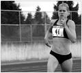
| 05/28/2003 03:40:45 PM |
For The Lineby jimmythefishComment: The expression on her face looks irritated (hey! stop taking pictures of me in my underwear!) rather than the intent I would've expected from the title; I suspect I'm the only one who will be amused by that, though. Strange angle makes the left side (really the right side) of her body seem deformed -- might have been better from a different angle? |
 Photographer found comment helpful. Photographer found comment helpful. |
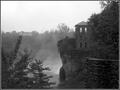
| 05/27/2003 08:08:59 PM |
Overlookby wdebeau1Comment: Now this is excellent. Unlike some of the B&W photos I've seen, I'm content to view this in B&W rather than wish I could see it in colour; the mist coming off the water and the brick look quite neat this way. Compositionally, angle and distance are lovely; the trees in the left bottom do not distract because the mist in the center helps draw the gaze rightwards. This is by far my favorite of what I've seen so far. |
| Photographer found comment helpful. |
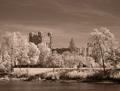
| 05/27/2003 08:06:37 PM |
The Castleby inspzilComment: That's a very nice shot particularly in terms of angle and distance. The bright highlights on the trees are perhaps a little too bright. Maybe a darker sepia toning would have helped? |
| Photographer found comment helpful. |
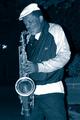
| 05/27/2003 09:49:54 AM |
Blues in Blueby jmark53Comment: I swear I just saw this guy in New Orleans. Nice play on words, the tone versus the subject. |
| 05/27/2003 09:49:08 AM |
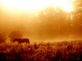
Headed Homeby drdab99Comment: Wow, this is gorgeous. The two-tone aspect seems very natural with the sunlight as it is, and I like the way it starts bright at the top with a fade to the deep shadows at the bottom edge. The only real flaw is the horse might have looked better either against the brighter portion or against a deeper one. |
| 05/27/2003 09:47:36 AM |
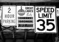
SPEED LIMIT 35by connieComment: I actually find the shades of wood in the background more interesting than the signs themselves. I suspect I would have liked the composition better with the focus on the speed limit sign as the two other signs don't come across as well in B&W, whereas of course a speed limit sign is naturally. |
| 05/27/2003 09:46:24 AM |
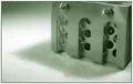
Cold Steelby MitonskiComment: Interesting choice of shade for this -- I would have tended to think of a bluer tone for the 'cold' part but the greenish tinge actually works quite well. |
| Photographer found comment helpful. |
| 05/27/2003 09:45:38 AM |
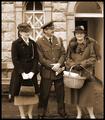
Welcome Homeby tragicharpyComment: This looks like a very old photo, as it's surely meant to, and a very good setting for it as well. The people in it seem uncomfortable to be photographed (which if they were asked to dress up for this old-style photo I suppose I may understand), which has the drawback of making it look less like the 'welcome' of the title. |
| 05/27/2003 09:44:08 AM |
Shadow Danceby autoolComment: I like the angle you did this at, makes the shadow very interesting with that curvature. A good subject for a duotone topic, IMO. |
| Photographer found comment helpful. |
Home -
Challenges -
Community -
League -
Photos -
Cameras -
Lenses -
Learn -
Help -
Terms of Use -
Privacy -
Top ^
DPChallenge, and website content and design, Copyright © 2001-2025 Challenging Technologies, LLC.
All digital photo copyrights belong to the photographers and may not be used without permission.
Current Server Time: 08/18/2025 12:26:57 PM EDT.