| Image |
Comment |
| 06/01/2003 10:45:09 PM |
The Guitaristby arnitComment: Inasmuch as the tone on this is good, the choice of focus does nothing for me. Either more on the guitarist, or a different angle showing more of the guitar, would have been preferable to me. |
| 06/01/2003 10:44:14 PM |
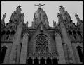
Tibidabo´s churchby AlexysComment: I admit to being prejudiced in favor of churches, which helps. This looks interesting in grayscale, but I think a higher light level (or a brightness adjustment) would have been nicer. |
| 06/01/2003 10:43:38 PM |
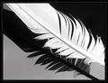
Birds of a feather by JeanComment: Very, very nice. Light and shadow, white and black, and the grey for neutrality. It looks like you have a couple little pixel artifacts up in the right corner but aside from that this is perfect. |
 Photographer found comment helpful. Photographer found comment helpful. |
| 06/01/2003 10:42:56 PM |
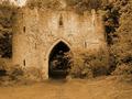
Castleby trishComment: This is a gorgeous shot, but I would have picked a slightly different shade -- this one is somewhat sickly -- for the sepia. Perhaps a less intense one. |
| 06/01/2003 05:51:46 PM |
Above The Rimby greenem2Comment: I cannot for the life of me figure out what this is. It's interesting in terms of a study of varying shades of grey, but not being sure what I'm looking at is... distracting, I think is the word I want. |
| 06/01/2003 05:50:32 PM |
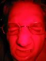
Booh !by ewebComment: Er. Interesting. I think with that colour scheme I would have gone with a different expression, something more sinister. |
| 06/01/2003 05:49:58 PM |
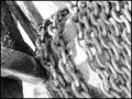
Chainsby ursulaComment: Probably a bit too much light-on-light here to really emphasize the topic, although it's an interesting concept. |
| Photographer found comment helpful. |
| 06/01/2003 05:49:30 PM |
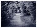
Road To Nowhereby auroraComment: The first thing I thought was "It's the road to South Park!" -- which will only make sense if you both watch South Park and have seen the "It's Butters!" episode. Nice... I like the way the path fades down at the end, and how it's framed by the trees. |
| 06/01/2003 05:48:40 PM |
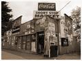
Signs of the Timesby timj351Comment: If it weren't for the prices, this would look entirely like an old picture of an old general store, which is neat -- and presumably the idea. Good job on making it look very old-photograph. |
| Photographer found comment helpful. |
| 05/31/2003 02:41:20 AM |
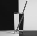
Black & white H2Oby ladpupmoeComment: Hmm, honestly I think I would have liked this better withOUT the straw. The refraction just looks very odd, probably the more so because of being in B&W -- it actually looks like a separate object completely (including in that it looks like a Twizzler underwater). |
| Photographer found comment helpful. |
Home -
Challenges -
Community -
League -
Photos -
Cameras -
Lenses -
Learn -
Help -
Terms of Use -
Privacy -
Top ^
DPChallenge, and website content and design, Copyright © 2001-2025 Challenging Technologies, LLC.
All digital photo copyrights belong to the photographers and may not be used without permission.
Current Server Time: 08/18/2025 02:40:41 PM EDT.