| Image |
Comment |
| 06/09/2003 06:23:12 PM |
Iced Teaby JB707Comment: Kind of interesting lighting. I know everyone says "don't center your photos" but when it's the only object and it takes up the majority of the frame, it does tend to work better IMO -- a tight crop like this just looks unbalanced to me when the subject isn't centered. |
 Photographer found comment helpful. Photographer found comment helpful. |
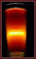
| 06/09/2003 06:21:57 PM |
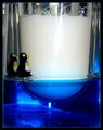
Pure Maple Syrupby GraciousComment: Mmm. Syrup. Waffles. Mmm. MMMMMMM.
Gosh darn it, more food! This has been an agonizing voting round! I like the shot overall, the placement/framing, the idea. It seems a bit washed out and/or overly yellow at the top third or so; the bottom third is much better. |
| Photographer found comment helpful. |
| 06/09/2003 06:20:13 PM |
Cream Sodaby adc20Comment: This looks very odd to me -- the bits on top, what are they? And are those disc-shaped bits of ice? They rather look like coins. I think in this case too close-up a shot. The connection to the topic is fine. |
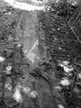
| 06/09/2003 06:18:35 PM |
liquefied earh also known as mudby alteregoComment: Without meaning to get into a debate, I'm not sure that water + dirt qualifies as 'not water', so I'm a little iffy on the topic connection.
Other notes: I don't think this worked well as black and white as there's not a lot of contrast. It's also not a terribly attractive shot although since your subject was mud I'm not sure there's much else one could do to make it attractive. It's possible in colour this would be alleviated somewhat, although who knows. |
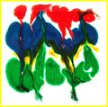
| 06/09/2003 04:52:17 PM |
Abstract Liquid Art (Food Coloring On Milk)by GolferDDSComment: I'm not a big abstract fan (you'll probably see this a lot in my comments) but I have no problems with this topically and I like that the shapes are distinct enough to view things in them a la Rorshach but flow enough to mix the colours and give that liquid sense. I kind of wish you'd either omitted the border or made it less bright. |
| Photographer found comment helpful. |
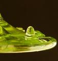
| 06/09/2003 03:08:41 AM |
Gloopby hawkidaComment: It's.... ALIVE!
It does kinda look alive, which is interesting. Very liquidy, no distractions from the main subject, so good composition even if the subject is a little on the strange side. |
| Photographer found comment helpful. |
| 06/09/2003 03:08:04 AM |
In the bathroomby GalyNetComment: Er... I ASSUME that's soap but it looks an awful lot like milk, very confused for a moment there.
This is good, lots of emphasis on the liquid, good lighting. I like the bird, it's a cute touch. |
| 06/09/2003 03:06:34 AM |
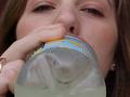
Drinking Lemonadeby MattWComment: Unfortunately the angle sort of emphasizes the nostrils, not my favorite thing to be looking at. The idea's fine, it fits the challenge, and at least it's not Coke (too many of those). |
| 06/09/2003 03:05:43 AM |
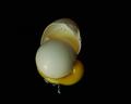
Liquid&Solidby TiberiusComment: Honestly I think I would have preferred this without the front shell half being present, as I like the idea but that sort of takes focus (in the viewing sense) from the liquid part of this. I do like it against a black background, really makes it stand out as no doubt was the point. |
| Photographer found comment helpful. |
| 06/09/2003 03:04:06 AM |
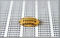
Drop of Honey by JackoComment: Hmm, well, kind of overly-arty for my tastes. I'm fine with the use of honey and I do like the word refraction but I think there's way too much emphasis on the printout and not enough on the liquid; to some degree it's de-emphasized because of the focal blur but it's still a bit much. |
| Photographer found comment helpful. |
Home -
Challenges -
Community -
League -
Photos -
Cameras -
Lenses -
Learn -
Help -
Terms of Use -
Privacy -
Top ^
DPChallenge, and website content and design, Copyright © 2001-2025 Challenging Technologies, LLC.
All digital photo copyrights belong to the photographers and may not be used without permission.
Current Server Time: 08/24/2025 06:41:55 AM EDT.