| Image |
Comment |
| 06/11/2003 09:03:13 PM |
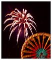
Highlights for Children - 4th of July Issueby rj324Comment: While I've never seen anything quite like this on HiglLights, in a special edition perhaps I can imagine it. The photo is fairly well suited towards the topic, although a bit shy on cover-copy space, though I think that's less of an issue for Highlights. I wish given the colourful Ferris Wheel you could have gotten a more colourful firework, but it's still nice. |
 Photographer found comment helpful. Photographer found comment helpful. |
| 06/11/2003 09:01:40 PM |
Cigar Aficionadoby crabappl3Comment: Precisely the type of thing I've seen on Cigar magazines. I don't know yours in particular but other versions have had items like this. Lots of negative space at the top seems common, lots of room for the text. Close-up to show the brand and style is also common. I can easily see it. Good job. |
| Photographer found comment helpful. |
| 06/11/2003 08:37:30 PM |
ELLEby jenaromComment: Best women's magazine pose yet, although frankly I cannot imagine Elle putting that particular top on the front cover of their magazine (I could be wrong). Also, the grass in the background may not have been the best choice -- against sky might have been better, or a neutral background in general. Model's makeup and hair is about what I'd expect from such a photo. Crop seems about right for this magazine. |
| Photographer found comment helpful. |
| 06/11/2003 08:36:07 PM |
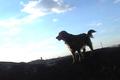
"DOG WORLD"by melissartsComment: No issue with your basic subject, but the dog is difficult to see due to lighting which would make it less a good candidate for a cover photo. Cropping would be possible with this shot to fit cover format, but colours being as they are might make copy placement difficult. Seems a bit blurry. |
| Photographer found comment helpful. |
| 06/11/2003 08:35:03 PM |
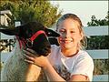
4-H Projects Newsby sherryk471Comment: Blurry and too bright. Not sure how a crop would end up looking if photo was too large or wrong dimensions, so possibly too-far cropped (and small). Topically it seems fine. |
| 06/11/2003 08:34:23 PM |
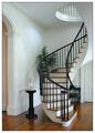
Home and Design by sherComment: This is an amazing-looking home, if it's yours I'm very jealous.
Also, I can EASILY see this gracing a home design magazine. Even though there's very little in the way of decor it's the sort of clean, simple lines such publications seem to favor for shots like this. It's very crisp and clear, well-lit and cheerful. There's room for copy and logo. |
| Photographer found comment helpful. |
| 06/11/2003 08:32:18 PM |
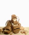
Flare (Canada's Fashion Magazine)by friscaComment: With a setup like this, a blue backdrop would have been preferable to more closely mimic the beach setting. I'll assume your magazine exists; as a fashion magazine this is a reasonable setup. I don't know but that they might have chosen a more contrasting shoe colour and worked the text around it, though this way makes it easier for the copy compositor, certainly. Lots of space up top for copy, too. |
| Photographer found comment helpful. |
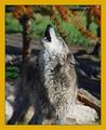
| 06/11/2003 08:29:39 PM |
National Geographic-Wolves in Captivityby sagestudioComment: Way to catch the howl, very nice. Shot seems rather blurred everywhere but the muzzle and vicinity; I think a sharp focus on the wolf entire would have been preferable. I think NG is more prone to wild than captivity themes but it doesn't seem entirely unlikely. |
| Photographer found comment helpful. |
| 06/11/2003 08:28:34 PM |
Mushroom Newsby LarsPaysenComment: Mushroom News... heh, whaddya know, it really exists. (No offense, I just had to check; I would have suggested Mycologia instead otherwise.)
Fits the magazine topic just fine. Maybe a little busy of a background for easy text laoyout but only becaues of the pale patches, and it's probably workable with. A close-up shot on what appears to be damage could easily go with a cover story. |
| Photographer found comment helpful. |
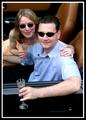
| 06/11/2003 08:25:35 PM |
PLAYBOYby dan_pendletonComment: The problem here, of course, is that so far as I know Playboy has never done a cover that didn't feature a single model, usually the centerfold model. You would have been better off with some other men's magazine.
Also, I would be more prone to think that on a men's magazine, "chick in a car" would be more likely than "couple" in a car, because, of course, guys want to believe they can have the chick and the car (it's a marketing gimmick).
I would have been more prone to buy this as some sort of celebrity-focus magazine even without it being a picture of recognizable celebrities. |
Home -
Challenges -
Community -
League -
Photos -
Cameras -
Lenses -
Learn -
Help -
Terms of Use -
Privacy -
Top ^
DPChallenge, and website content and design, Copyright © 2001-2025 Challenging Technologies, LLC.
All digital photo copyrights belong to the photographers and may not be used without permission.
Current Server Time: 08/18/2025 10:50:14 AM EDT.