| Image |
Comment |
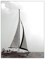
| 06/30/2003 07:53:35 AM |
Boatersby AleciaComment: Wonderful photo, nice composition. A little overexposed for my taste, I'd have liked more detail in the sky and less glare in the sail. Boat could be sharper. 9 |
 Photographer found comment helpful. Photographer found comment helpful. |
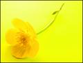
| 06/30/2003 07:52:25 AM |
Buttercupby marboComment: Really captures the essence of this buttercup, great concept. Love the way it almost blends in with the background. I'd have prefered a little less glare on the stem. Something about the composition bothers me... maybe I'd like the angle of the stem more shallow so there's less white space at the right hand side. 9 |
| Photographer found comment helpful. |
| 06/30/2003 07:50:31 AM |
Feeling blueby p_johnsComment: Impressive! The exposure on the person is perfect. Good concept. Hope it does well! 10 |
| Photographer found comment helpful. |
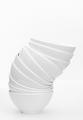
| 06/30/2003 07:49:06 AM |
Bowlsby FranziskaLangComment: My favourite this challenge. A great high-key photo. I love the simplicity, the exposure is perfect. A great art pic out of the most ordinary and mundane items... 10 |
| Photographer found comment helpful. |
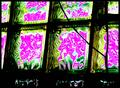
| 06/30/2003 07:19:20 AM |
Bifurcating ...by GeneralEComment: Bifurcating... that's a new one to me! I'll add it to my vocab. I'm not averse to abstracts, but this one just doesn't do it for me... and I don't think you thought of the word first and then took the picture, so it feels like this has been stretched to meet the challenge. The intereference patterns are interesting, but the overall composition is not pleasing to my eye... the branching line is not immediately obvious, so once you know what the word means, the relevance still doesn't jump out at you. Perhaps if you cropped so that only the 1 1/2 squares in the bottom right were visible this might improve it for me. 4 |
| Photographer found comment helpful. |
| 06/30/2003 05:35:23 AM |
B major Barre Chord in Blueby orussellComment: B Major... I am kicking myself, that is such a great idea!
Bit too much contrast here for my taste, to many shades that are either very bright or very dark. I would have liked it a bit sharper as well... perhaps taken in strong light, and then a blue filter applied in Photoshop. Interesting light for the hand, but leaves an unappealing shadow on the fretboard. Almost a nice piece of stock photography! 8 |
| Photographer found comment helpful. |
| 06/27/2003 05:22:56 AM |
|
| 06/27/2003 04:34:26 AM |
Fountains Abbey by BobsterLobsterComment: Wow, thanks for all your kind comments... number 1 ribbon by a WHISKER!
Perhaps dodging and burning might be a good thing... lol
Go Pentax Optio S! Message edited by author 2003-06-27 04:36:23. |
| 06/26/2003 12:09:46 PM |
What are you looking at?by deadbirdComment: Chickens are great, aren't they? Yours has great character, but there's a few things that detract for me:
I would have liked the face a bit sharper, specifically in the area of the eyes.
There's a shadow across his right side that I don't think is effective.
The white feathers on the right are a bit too bright... you can't make out the details.
The background takes away from the composition: The white path and tractor(?) distract the eye from the chicken, as well as the horizon cutting across the face.
The red thingy above the face is too deeply saturated... you can't make out any detail in it.
Phew, that's it now! Good picture otherwise! 6 |
| Photographer found comment helpful. |
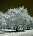
| 06/26/2003 12:04:29 PM |
The Orchardby Chilly0999Comment: Lots of infra-red out there! I would have prefered the horizon level, and more detail in the whites of the leaves... they look a little overexposed to me. Other than that, very striking, effective picture. I would also have liked something to break up the regularity of the patterned trees. 7 |
| Photographer found comment helpful. |
Home -
Challenges -
Community -
League -
Photos -
Cameras -
Lenses -
Learn -
Help -
Terms of Use -
Privacy -
Top ^
DPChallenge, and website content and design, Copyright © 2001-2025 Challenging Technologies, LLC.
All digital photo copyrights belong to the photographers and may not be used without permission.
Current Server Time: 06/21/2025 05:47:18 PM EDT.