| Image |
Comment |
| 07/16/2003 08:23:05 AM |
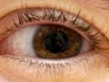
Wide Eyesby shareinncComment: A great shot! Unfortunately, I think you've focused on the bridge of his/her nose rather than the eyes, and the dof is really shallow. Lighting is a bit too harsh, the glare on the eyes really detracts. Great composition though. 7 |
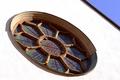
| 07/16/2003 08:20:00 AM |
The only way is upby GrziComment: VERY nice composition, but the light is far too harsh. Did you take this midday? A shame... I really like the shapes, the stark white, the roof at the top right. A shot at the end of the day could still provide you with shadows, but also bring out some of the colours in the window. 6 |
 Photographer found comment helpful. Photographer found comment helpful. |
| 07/16/2003 08:15:31 AM |
|
| Photographer found comment helpful. |
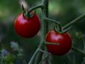
| 07/16/2003 08:14:20 AM |
morning tomatoesby MIN-BITERComment: Beautiful colours, perfect exposure. The morning light is very kind to your tomatoes. Great dof. However, the composition is too centred for my taste. 7 |
| Photographer found comment helpful. |
| 07/16/2003 08:13:00 AM |
|
| 07/16/2003 08:06:41 AM |
round diceby KAOSComment: A great idea, I like the juxtaposition of the square patterns in the backround with the round dice. However, the lighting really lets you down here. It's much too harsh. and I don't care for the composition. It's a matter of taste, but I might have tried shooting from above with 2 diffused light sources. 6 |
| Photographer found comment helpful. |
| 07/16/2003 07:58:44 AM |
Dawn on Iceworldby bot_alphaComment: Very nice idea, but the glare spoils it for me. It looks a bit overexposed. A shame, because I think there potentially are a lot of interesting textures in here. 4 |
| Photographer found comment helpful. |
| 07/16/2003 07:57:41 AM |
Perfect-leah-roundby fleenkComment: Very amusing, a real laugh out loud picture. Unfortunately, this is why I can't mark it highly... it's not very flattering, is it? Lighting is very harsh, and it is a really strange expression you've captured. The skin tones look a bit odd at the edge of the picture. 4 |
| 07/16/2003 07:52:23 AM |
School Yard Funby MitonskiComment: Light is too harsh, you can see this from the highlights and the sharply defined shadows. Try this shot at the end of the day! Composition seems a litle off. I don't like the one that is cut in half at the top left. Not a very inspiring background. 4 |
| Photographer found comment helpful. |
| 07/16/2003 07:50:29 AM |
In Balanceby InnaNComment: Nice idea, it would have worked a lot better if you had managed to diffuse the shadows better! The glare on the glass is a little offputting. Great high-key image. 7 |
| Photographer found comment helpful. |
Home -
Challenges -
Community -
League -
Photos -
Cameras -
Lenses -
Learn -
Help -
Terms of Use -
Privacy -
Top ^
DPChallenge, and website content and design, Copyright © 2001-2025 Challenging Technologies, LLC.
All digital photo copyrights belong to the photographers and may not be used without permission.
Current Server Time: 06/22/2025 02:22:25 AM EDT.