| Image |
Comment |
| 05/15/2003 04:09:55 PM |
ADORATION in REDby smfsnowindComment: The lighting is so washed out that what I'm assuming is a vase looks like a thumb-smudge, and the values in the rose are reduced to almost paper cutouts instead of actual petals. It's very strange-looking. The baby's-breath is in focus, as is the hand, but not the top of the rose or the vase? Unusual choices, there. |
| 05/15/2003 04:08:46 PM |
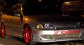
Performanceby MusicmanComment: The color feels incidental, not central, to this shot, so I have to grade down a bit to leave room at the top for people who made the theme the star. Also, it's incredibly dark and muddy-looking, except for one part of the bumper. |
 Photographer found comment helpful. Photographer found comment helpful. |
| 05/15/2003 04:08:14 PM |
Balloonsby WILDBLUEComment: The focus and crop and general lighting, etc, combine to make this look like you cut pieces out of construction paper and photographed them. I believe that you DID shoot balloons, but they could have been anything. :-> If you wanted the balloonyness to show, different choices would have helped; if you didn't care about the balloonyness, you could have saved yourself some trouble and just shot construction paper. :-> |
| Photographer found comment helpful. |
| 05/15/2003 04:06:42 PM |
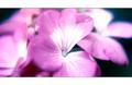
Berry Deliciousby ladpupmoeComment: The lighting and saturation on this shot, combined with the very soft focus (or overprocessing, depending how you got the effect) on most of the strawberries, combines to make me think my glasses aren't on straight. The colors might have been better contrasted by a not-yellow plate, something to make it clear there IS a white or non-red value somewhere in the frame. Just thinking out loud. :-> Also, the composition's kind of ... all over the place. There's no one place the eyes are drawn or directed, no center of attention. |
| Photographer found comment helpful. |
| 05/15/2003 04:03:39 PM |
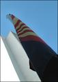
Primary Arizonaby tfarrell23Comment: This shot looks like it's trying to be avant-garde, but it's not really *about* anything and it's lit really weird so it doesn't end up achieving anything, really, IMHO. It's got diagonal composition, which can be good, but in this case looks like it was thrown in 'to make it more interesting.' That really only works when what you're photographing has a little interest of its own. Also, given that the flag is lit far darker than anything else in the frame, it almost looks like it's fallen down a little itself-shaped hole, a very odd effect (and probably not intended). |
| Photographer found comment helpful. |
| 05/15/2003 04:01:54 PM |
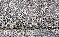
primary colorsby GotchyaComment: Uhm. Why are the white bits yellow? It's very odd-looking. The first impression that jumps to my mind (besides 'he turned up the yellow in photoshop for no reason') is 'Wow, someone peed on the flag.' Probably not what you intended. |
| Photographer found comment helpful. |
| 05/14/2003 02:17:53 PM |
Inner City Emeraldsby peter_kComment: I'll try not to be bitter that you did the same concept as me but amazingly better. And then I'll try not to be baffled that mine ended up finishing slightly ahead of yours! Ahhwell, I'm learning. For what it's worth, I gave it a 7. |
| Photographer found comment helpful. |
| 05/14/2003 11:02:35 AM |
Fruityby willtataComment: If you're going to go for the TMI-cam macro, it should have a sharp focus *somewhere* in the frame. |
| Photographer found comment helpful. |
| 05/14/2003 11:01:52 AM |
|
| 05/14/2003 11:00:37 AM |
|
Home -
Challenges -
Community -
League -
Photos -
Cameras -
Lenses -
Learn -
Help -
Terms of Use -
Privacy -
Top ^
DPChallenge, and website content and design, Copyright © 2001-2025 Challenging Technologies, LLC.
All digital photo copyrights belong to the photographers and may not be used without permission.
Current Server Time: 06/20/2025 02:58:31 PM EDT.