| Image |
Comment |
| 09/18/2008 10:16:51 AM |
|
 Photographer found comment helpful. Photographer found comment helpful. |
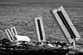
| 09/18/2008 10:16:27 AM |
What can go wrong?by SpongetoastComment: Nice photo. The horizon looks off, and the foreground is a bit dark compared to the blown background. The 'safe' concept isn't really jumping out at me. |
| 09/18/2008 10:15:24 AM |
SAFETY at LASTby dragonballzfsrComment: Really provocative photo. A great idea, and I think it meets the challenge very well.
Though your concept is great, there are some technical issues with this photo IMHO. I think if the shadows were closer and darker, it would be more effective. I wish the photo wasn't cropped so close.
Excellent idea, and you get points for originally, which in my opinion is severely lacking here. |
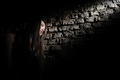
| 09/18/2008 10:10:30 AM |
My light!by oldEyeComment: This is great. The lighting is very, very effective, and the levels are good.
At first glance though, this almost looks like the subject is in a dungeon or somewhere quite 'unsafe'! My opinion only. |
| Photographer found comment helpful. |
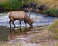
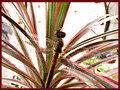
| 09/18/2008 10:08:58 AM |
Midstream Drink during the Rutby hahn23Comment: First off, this is an excellent photo. Nice and clear, and I do like the colours, though I believe the brown could have been brought out a bit more to make the animal stand out.
I'm not getting the concept of 'Safe' though. |
| Photographer found comment helpful. |
| 09/18/2008 10:07:19 AM |
Perfectly Safeby KeertiComment: Why is the dragonfly perfectly safe? The blown out background really distracts from the subject IMHO. |
| Photographer found comment helpful. |
| 09/18/2008 10:06:20 AM |
cautionby troy77Comment: A neat idea that is well executed. That single headlight is a bit distracting, and it's too bad that the red in the sign couldn't have been brought out more so it really said 'caution'! Nice though. |
| Photographer found comment helpful. |
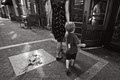
| 09/18/2008 10:04:38 AM |
Family by MelethiaComment: A very nice photo, but my eye keeps getting drawn to that tag or whatever it is on the shirt. The B&W treatment works well here. |
| Photographer found comment helpful. |
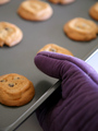
| 09/18/2008 10:03:34 AM |
Just Like Mama Taught Meby beckydiComment: Yeah, nice. I like the shallow DOF in this shot. It looks like some natural light coming in from the right.. It might have looked a bit better if it was coming from the left, so it lit the inside of the mitt and the front cookie instead. Still good though. |
| Photographer found comment helpful. |
| 09/18/2008 10:01:51 AM |
The Helmetby phloverComment: Sorry, not a big fan of the processing. I like the composition very much though. |
| Photographer found comment helpful. |
Home -
Challenges -
Community -
League -
Photos -
Cameras -
Lenses -
Learn -
Help -
Terms of Use -
Privacy -
Top ^
DPChallenge, and website content and design, Copyright © 2001-2025 Challenging Technologies, LLC.
All digital photo copyrights belong to the photographers and may not be used without permission.
Current Server Time: 08/25/2025 11:25:57 PM EDT.