| Image |
Comment |
| 06/13/2003 08:39:06 AM |
BASEBALL DIGESTby purpletrollComment: this empty stadium for me looks very sad, it is like river without water. sky is blown away also. = 3 |
| 06/13/2003 08:36:50 AM |
Runner's Worldby ToddhComment: the sky is totally blown out due to incorrect exposition, I like this usage of higher apperture value to get just runner in the forground sharp. = 5 |
| 06/13/2003 08:34:15 AM |
|
 Photographer found comment helpful. Photographer found comment helpful. |
| 06/13/2003 08:32:40 AM |
|
| Photographer found comment helpful. |
| 06/13/2003 08:30:51 AM |
Wooden Boatby mrhburComment: you should cut that damaged part of the boat. also there is blue cast over white color, it looks like you did not set white balance correctly. Also composition lines are a little bit wierd, it looks like its can not connect in the infinity point, maybe that's due to the reflection. this white part on the left top side looks bad. = 3 |
| Photographer found comment helpful. |
| 06/13/2003 08:26:13 AM |
Jaguar Product Catalogby K-RobComment: nice photo, but challenge is magazine cover not catalog cover. I like colors, but jaguar is a little bit hard to recognise "real jaguar". = 4 |
| Photographer found comment helpful. |
| 06/13/2003 08:24:42 AM |
Time Out : Londonby hawkidaComment: nice composition, I like blur on his hand, it showing some moving. nice colors. but people in the back looks like they are not there because they look to the totally different side. = 6 |
| Photographer found comment helpful. |
| 06/13/2003 08:23:10 AM |
www.cuartoscuro.comby diegohsComment: maybe composition would be better if this guy is totally cropped on his left side, near the neck because when I'm looking at the photo he is looking right and he moving my eyes on the right side and there is nothing to see. = 4 |
| 06/13/2003 08:20:39 AM |
The Great Outdoors (TGO)by Geo_GriffinComment: i like shadow cast over the hill and the whole landscape looks beautifull, but this guy IMO does not belong to this photo, I do not why, but he just does not fit. because you have nice grass, nice sky, nice shadows, nice composition lines. = 6 |
| Photographer found comment helpful. |
| 06/13/2003 08:18:33 AM |
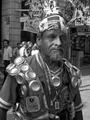
National Geographicby InnaNComment: some parts of the ladies face is a little bit white areas. IMO maybe image would be better if you crop below her right hand and fill up frame more with their heads. = 4 |
| Photographer found comment helpful. |
Home -
Challenges -
Community -
League -
Photos -
Cameras -
Lenses -
Learn -
Help -
Terms of Use -
Privacy -
Top ^
DPChallenge, and website content and design, Copyright © 2001-2025 Challenging Technologies, LLC.
All digital photo copyrights belong to the photographers and may not be used without permission.
Current Server Time: 08/04/2025 11:38:12 AM EDT.