| Author | Thread |
|
|
06/19/2003 02:58:55 PM |
Regarding the lighting:
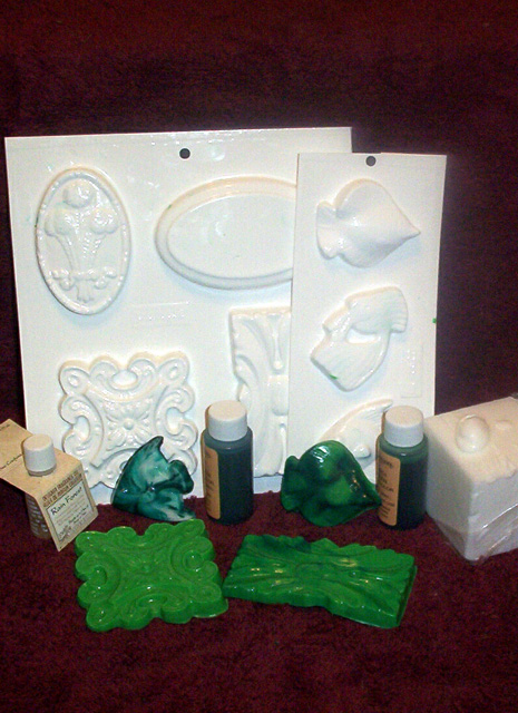
Yeah, I saw how bright the molds ended up. In dim light they're just slightly whiter than the block of coconut soap, but they're EXTREMELY reflective and lowering the lighting more made the rest too dim. Spot-editing isn't allowed for the challenge, but it would be for a magazine shot, so I figured 'too bright' was better and easier to clean up, which I did for a lark along with assembling the cover fully. I'd post those but I've kinda lost interest in the idea. Maybe later, though.
Regarding labels:
Lots of magazines prefer to not show brand names on the cover because they don't want to endorse a specific magazine. Combine that with the fact that from the front you cannot tell those are coloured dyes, and the decision to turn them may make more sense.
I had some versions of this with a paler background but the soap didn't stand out well on it, so I reverted to this. The backdrop is a towel. My choices were that, black (which would be worse for emphasizing the brightness of the molds), and pale blue (which the soap was not as easily visible against it). I think if I'd had a softer red it would have worked out better, but alas I did not. |
|
Comments Made During the Challenge  |
|
|
06/17/2003 12:32:42 PM |
|
I like this, but the colours seem a little off and the carpet isn't complementing the composition well. Also seems a bit grainy and out of focus without real purpose. |
|
 Photographer found comment helpful. Photographer found comment helpful. |
|
|
06/16/2003 12:55:29 PM |
|
I think I'd prefer a lower angle on this so that we are not looking at the tops of the bottles, but rather looking straight on at them (or close) so that we can see what it even is. Also, maybe better had the labels been turned our way. Focus seems a bit soft. not really as crisp as I'd like to see for a magazine cover. Good products though. The shot is a little unballanced by the large block on the right sticking so far out of the photo, and for the most part, the left is mostly in the frame of the photo. |
|
| Photographer found comment helpful. |
|
|
06/16/2003 12:56:50 AM |
|
| Photographer found comment helpful. |
|
|
06/13/2003 04:28:28 PM |
|
Rough lighting. Looks a little too "display." I think they like to set it up so it's on display, but looks like someone is actually using the stuff. |
|
| Photographer found comment helpful. |
|
|
06/13/2003 01:38:23 PM |
|
The lighting is a little weak. |
|
| Photographer found comment helpful. |
|
|
06/13/2003 08:34:15 AM |
|
too much reflections on the top and too dark at the bottom. you should set up light better to bypass this problem. = 3 |
|
| Photographer found comment helpful. |
|
|
06/12/2003 11:49:25 AM |
|
Turn lables towards the camera, and try arranging stuff a bit nicer. |
|
|
|
06/11/2003 06:31:01 PM |
|
The white in this image is almost blinding... I'm not sure why it is, but there seems to be like a halo around the white.... This is interesting... did you actually make these soaps? Thats fun :-) This picture could be the front if you played around with your lighting and stuff a little more... it doesn't look extremely professional right now. |
|
| Photographer found comment helpful. |
Home -
Challenges -
Community -
League -
Photos -
Cameras -
Lenses -
Learn -
Help -
Terms of Use -
Privacy -
Top ^
DPChallenge, and website content and design, Copyright © 2001-2026 Challenging Technologies, LLC.
All digital photo copyrights belong to the photographers and may not be used without permission.
Current Server Time: 06/28/2026 02:11:21 PM EDT.