| Image |
Comment |
| 02/10/2004 08:07:12 PM |
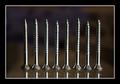
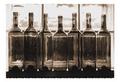
screwyby loboz33Comment: My first thought was that I wish these screws were all the same height. The more I looked at it though, I'm thinking that it's also cool that they aren't. I really like the reflection beneath them. Good lighting and composition. |
| 02/10/2004 08:05:44 PM |
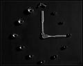
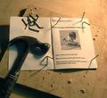
Tool Timeby cbellerComment: I like and appreciate this idea. There isn't enough interest here though and I don't know what to suggest to help that out. I'm not a big fan of the dark and long shadows. I do like the use of a solid background. |
 Photographer found comment helpful. Photographer found comment helpful. |
| 02/10/2004 08:01:42 PM |
Fisher-Price - more than just garage artby Kind of BlueComment: I'm sorry - I just don't see this fitting well in Garage Art. I think I understand where you were going with it, but it just doesn't work for me. Outside of that - your lighting is good. The dof is too shallow. |
| Photographer found comment helpful. |
| 02/10/2004 07:55:22 PM |
|
| 02/10/2004 07:55:03 PM |
Spinning by D-ManComment: Wow... cool shot. :-) Love the black and white, lighting and composition are good. Nice work.... |
| Photographer found comment helpful. |
| 02/10/2004 07:54:17 PM |
|
| Photographer found comment helpful. |
| 02/10/2004 07:54:02 PM |
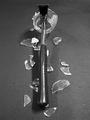
Translucenceby Spanish_GreaseComment: I don't really care for the border, but I like the color tone and grain. Lighting looks good also. |
| 02/10/2004 07:53:16 PM |
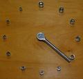
Avid Learnerby stickylizardComment: Since there are already bent nails in this composition, it might be better to leave the extras out. It does still look good the way you have it. The lighting seems a little uneven as you have a brighter area in the upper right hand side, but that might have been intentional. Overall, a good idea and well executed. |
| Photographer found comment helpful. |
| 02/10/2004 07:51:24 PM |
Proud Papaby inspzilComment: Good idea, well executed. I like the lighting and composition. I wonder what this would like in black and white as well? Good job! :-) |
| Photographer found comment helpful. |
| 02/10/2004 07:49:57 PM |
Time for workby ClayaComment: This would look better on a solid background without the bright flash spot. |
| Photographer found comment helpful. |
Home -
Challenges -
Community -
League -
Photos -
Cameras -
Lenses -
Learn -
Help -
Terms of Use -
Privacy -
Top ^
DPChallenge, and website content and design, Copyright © 2001-2025 Challenging Technologies, LLC.
All digital photo copyrights belong to the photographers and may not be used without permission.
Current Server Time: 07/22/2025 11:23:05 AM EDT.