|
|
| Image |
Comment |
| 03/07/2010 08:38:19 PM | Radha Krishna - The real loveby amateurboiComment: Feedback from the DPChallenge Critique Club! :D
First of all, this is quite a charming subject, but since the entire photo has a lack of quality, and it wayyyy out of focus, it's hard to really connect with the image. This is quite an interesting setup, however you can't really see the feet of the figures and the rest of the image is filled with a low-detail background. The colors don't really work correctly here and those are the reasons why you didn't get above a 4.5 Lastly, almost always, you want your subject to be facing out into the largest portion of the photo. Like this. Photographers do this because it gives the eye the ability to fill in the rest and complete the tapestry of art the photography communicates. Cropping in a little harder on the right would set this photo to compositional correction. Otherwise, good eye for composition.
I wish I could be more helpful but I just don't see what else to fix in this photo. From your profile I can tell you have a good eye, but I just don't see that in this photo. I hope I was helpful! Message me with any questions you have.
-  ColemanGariety ColemanGariety
The DPChallenge Critique Club |  Photographer found comment helpful. Photographer found comment helpful. |
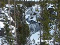
| 03/07/2010 08:31:25 PM | natures lugeby mrturtellComment: Here's your feedback from the DPChallenge Critique Club! :D
Wow, this is a great view! I'd love to know where this was taken! The landscape is beautiful, but the lighting in the photo is a bit flat. If you could have captured this with more light shining on the trees and waterfall, it would have a much brighter mood to it. While the snow is overexposed, the waterfall and the trees are very dark and boring. That's the biggest problem here. Also, there is no directly apparent subject, and the trees take up too much of the photo for there to be one. On the other hand, the waterfall was framed very nicely by the trees and brings this photo from a 4 up to a 4.8. it would also be nice to see either a bit more sky or no sky at all. The little sliver of clouds you have at the top of the photo don't really do much right now.
Hope that was helpful to you!
- ColemanGariety
The DPChallenge Critique Club |
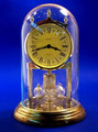
| 03/07/2010 08:26:29 PM | Time In A Bottleby e10icusComment: Here's your critique and feedback from the DPChallenge Critique Club...
This is a very interesting shot indeed. First of all, your subject is great, no flaws there, and this could be done very well. The biggest problem I see is your background. Truthfully! It's just blue! I'd like to see something more interesting like a guy looking into the clock, or maybe just a plain white background. Second, I don't really feel that color ads much here, I'd love to see a high-contrast version of this in B&W if possible. And third, The dirty glass and the reflections on it just take all the rest out of the photo. if you could have captured that glass in a more pristine way, and found a background that better suits the subject, you would've gotten a MUCH higher score. Hope that was helpful! :D
- ColemanGariety
the DPChallenge Critique Club | | Photographer found comment helpful. |
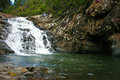
| 03/05/2010 09:28:41 PM | Cedar Creek Waterfallsby waynecantComment: Here's your requested critique and feedback! :D
Very cool waterfall! First off, composition-wise, this photo has no flaws. But when we look at overall quality, I have some things to point out. First, your photos main subject, (the waterfall) is blown-out and overexposed. Bringing your aperture down to about 4 and raising the shutter speed just a tad could have fixed this on-the-spot and gotten the splashing water in perfect, crisp condition. Overexposure is hard to get out in post-processing so this must be done on-camera. Second, the entire photo appears slightly out of focus, maybe it's just me but I find that to be very bothering. Third, I would like this tons more had there been a person maybe in the waterfall, jumping down or something, just to add a bit more interest to the photo. Overall, it's not a bad photo, but nor does it really catch my interest.
Hope that was helpful! :D
- ColemanGariety
The DPChallenge Critique Club |
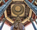
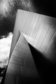
| 03/05/2010 09:19:51 PM | The Shrine of The Goddess of Mercyby angkokwengComment: Here's your critique and feedback, as requested!
First Impressions: "Oooohhh!!!"
Whoa, this is going to be fun! Okay, first off the intricate design work of this structure is perfect for architectural photography, and without even looking at the stats, I can tell this is from the "Constructed By Man" challenge. Composition-wise, this is perfect, the two pillars in front just make the image spectacular and the detail on the could be brought out to perfection. Those pillars are icing on the cake, so they should be ASAP (as sharp as possible). My first regret is that the scaffolding takes you out of the pictures mood, and until I look at that, your photo does a good job communicating that mood. I really wish the photo was a tad darker to bring out the contrast on the whole shrine, and I REALLY wish that you could see the sky. The sky is blown out, so a higher aperture and slower shutter speed would possibly (depending on your lighting situation) help you correct the overexposure in the sky. Had this been a night shot you could do soem long exposure work and REALLY make the photo POP!
This could have gotten a 7 from me if you would just bring out some more contrast, and give me some sky man! You did really well without a background, something that isn't very easy to do. Congradz!
- ColemanGariety
The DPChallenge Critique Club | | Photographer found comment helpful. |
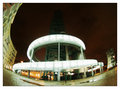
| 03/05/2010 09:09:37 PM | Decomissioned poluter - now landscape Artby duartixComment: Here's Your Critique and Feedback as Requested...
Wow, this is interesting! An odd use of fish-eye but I believe it works. First thing that kinda bothers me (a very minor issue) is that the building itself, as interesting as it is, is kind of difficult to make out form the background as it dissipate into the sky. maybe you were trying to go for this, but I would personally prefer it to be a bit sharper, closer to the camera, brighter, and just a tad bit further away from the bottom edge of the photo. Otherwise, your subject is quite eye-catching in its entirety. It would just settle with me a bit more if I could make out the top edge of the building. The soft-focus and coloring is done VERY well here, I would be surprised you didn't get a higher score had the building been more clearly exaggerated here. Second problem I see, and probably just as important as the first, is your work of framing the subject. Your use of fish-eye works because it wraps the building around the top of the image, framing your subject in the center. I would like this photo a million times better had there been a building to the right that framed your subject to the right side as well, the way the shot is composed, it just doesn't sit right with me.
Other then those minor technical details, I love this image, I really wish it had gotten more approval form the DPC voters. Had the building been sharper, more distinct, brighter and further away from the edge, this photo could have gone up to a 5.5 in my book, and with the a second building framing the subject to the right, this could have easily gotten a 6 or even a 7 from me. Congradz!
Please, feel free to message me if you have any questions! :D
- ColemanGariety
The DPChallenge Critique Club | | Photographer found comment helpful. |
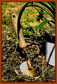
| 03/04/2010 01:34:32 AM | One with the Dirtby aurorabComment: Here's Your DPChallenge Critique Club Feedback As Requested! :D
Alright, lets see, first thing I notice when I look at the photo, has got to be the odd, distracting tones on the blade of the spade. It detracts from the interesting-ness of the subject and overall detracts from the image. In addition to that, the border doesn't match the photo at all and just makes you want to look away. The photo itself, is good in composition. I would rather the shadow did not fall on the spades handle but that's a minor detail. First thing, loose the border. I try to keep all my borders either black, white, or a black transparency. (as used in this image of mine) try one of those, but the brown just doesn't do it for me, or the DPC voters. Editing has created the distracting tones on the handle as well has taken away the images clarity, sharpness and overall quality. The post-processing is the biggest bungle in this image. And second to that would be interesting-ness, spade in the dirt near a plant isn't going to cut it generally for a challenge titled "In The Garden" obvious isn't always better. Anyway, overall, acceptable work, just lay-off on the pp a bit and don't make a border that will detract from the photo.
- ColemanGariety
The DPChallenge Critique Club |
| 03/04/2010 01:06:22 AM | | | Photographer found comment helpful. |
| 03/01/2010 08:50:05 PM | |
| 02/27/2010 01:48:45 PM | | | Photographer found comment helpful. |
Home -
Challenges -
Community -
League -
Photos -
Cameras -
Lenses -
Learn -
Help -
Terms of Use -
Privacy -
Top ^
DPChallenge, and website content and design, Copyright © 2001-2025 Challenging Technologies, LLC.
All digital photo copyrights belong to the photographers and may not be used without permission.
Current Server Time: 08/03/2025 02:17:28 AM EDT.
|