| Image |
Comment |
| 12/20/2007 08:53:01 AM |
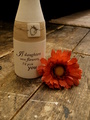
Irreplaceable Beauty - The Last Ever Gift From My Mumby Rainbow-Coloured-SoulComment: i'm not sure why you cropped the top of the bottle off, maybe something about the way it looked didn't fit the rest of the photo, but it kind of bothers me because my eyes keep trying to follow it beyond the photo. i also think the rug should have removed from behind, otherwise i would have given it a 10. the floor demonstrates my understanding of 'wabi-sabi' absolutely perfectly and i like the way it fades off into the darkness. and i love the overall colour of the photo. the flower is a beautiful touch. /9 |
 Photographer found comment helpful. Photographer found comment helpful. |
| 12/20/2007 08:42:07 AM |
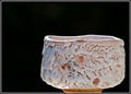
My Teabowlby tamatamaComment: i really like the contrast with the background. i am kind of in two minds about the crop, though |
| Photographer found comment helpful. |
| 12/20/2007 12:02:47 AM |
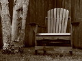
Winter Chairby dwainasaurusComment: fantastic! this is the type of photo i expected to see in this challenge. great job! /10 |
| Photographer found comment helpful. |
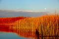
| 12/19/2007 11:59:16 PM |
moon over the bosqueby desertoddityComment: Originally posted by levyj413:
Nice composition. :)
It definitely looks too sharp. That can happen when you have very small details like in the reeds. Just don't sharpen it as much, or lower the default sharpening setting on your camera.
As you can tell from the comments, you can't please everyone on color. Some wanted less red, some wanted more blue. Just do what you like and accept it won't hit home universally.
The final aspect of scoring high is nailing the challenge, and you didn't quite get it right with this color combo. The key is to learn when your score reflected missing the challenge vs. not being a great photo. FWIW, I've been in many more challenges, and I still often miss the point voters are looking for. |
i thought the 'red' was orange. orange/blue was what i was going for as my comp colors. maybe i saturated it too much.
i don't know how i got the sharpness. this has happened to me before. (i have taken self portraits and my very 'fine' hair has come out looking like those reeds.) the only thing i did to it that had anything to do with sharpness was use the 'unsharp mask' that was suggested in something i read on this site and i don't even know what that does. i've got a lot to figure out and you have been a great help tonight. |
| 12/19/2007 11:42:59 PM |
Troll Guardian of Hellby desertoddityComment: Originally posted by levyj413:
Hey, I used to live right up the street from this guy. :)
I think your score was hurt by a few things. First, the lighting's really constant. Shadows and variations in light and dark add interest. Second, it looks like a quick snapshot that anyone could take without much thought. That works great for what I call a "memory-keeper" photo to help you remember a trip, and those are great to have for yourself. But in a contest, you need to stand out if you want to score high. Here, that might mean climbing up top and looking down, taking a closeup from an odd angle, catching some tiny kid looking straight up at the troll's face, etc. Also, crawl around, jump up, try things other than standing straight up and shooting straight on. Experiment!
Finally, there seems to be a blue cast to the shot. If you intended that, that's fine. But if not, search Google for "white balance" to learn how to use this important camera control and look at your D40's manual.
Keep shooting and keep entering. :) |
he just fascinates me. the size of him...wow. that's the second time i've gone there. the blue cast was purposeful...to make him look 'cold'. as he's under the bridge, are there times when there are shadows? |
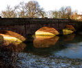
| 12/15/2007 05:45:33 PM |
Day 3 - Town Bridgeby jonfrommkComment: sweet! i love the light coming from under the bridge. it's glowing and the arcs of light are uniform under each one. it's beautiful.
my sour is that the sky is so bright. i'm not sure what to suggest, though.
edit: i also love the reflection of the arches in the water! Message edited by author 2007-12-15 17:46:51. |
| Photographer found comment helpful. |
| 12/15/2007 05:18:01 PM |
|
| Photographer found comment helpful. |
| 12/15/2007 05:11:19 PM |
|
| Photographer found comment helpful. |
| 12/14/2007 11:46:48 PM |
|
| 12/14/2007 11:38:21 PM |
An Eternity Without Loved Onesby rosemckayComment: i like this photo a lot. the environment and colours are great. the only thing i would say could be better is the model's pose and expression. it looks to me more 'sexy' than 'suffering from loss'. |
| Photographer found comment helpful. |
Home -
Challenges -
Community -
League -
Photos -
Cameras -
Lenses -
Learn -
Help -
Terms of Use -
Privacy -
Top ^
DPChallenge, and website content and design, Copyright © 2001-2025 Challenging Technologies, LLC.
All digital photo copyrights belong to the photographers and may not be used without permission.
Current Server Time: 08/01/2025 06:21:48 AM EDT.