| Image |
Comment |
| 07/13/2003 11:17:41 AM |
Curves and Stripesby kerrywcComment: terrific use of light. the b&w treatment of this .. or maybe the over use of curves or similar ... has made this person look plastic. I like the effect because it leaves the viewer to wonder. I may have tried to crop a bit more off the top of the frame. |
 Photographer found comment helpful. Photographer found comment helpful. |
| 07/13/2003 11:15:31 AM |
In the Ninth Monthby GekkerComment: jeez.. I looked like this more at 6 months! either this model is carrying small, or is not 9 months along! LOL
Anyway.. back to photography..
I think the pose is not as dramatic as it could be. It is more documentary than expressive. I think maternity portraits should be more expressive. The lighting is beautifully done, and the soft focus - though a bit too soft - is a good choice too.
|
| Photographer found comment helpful. |
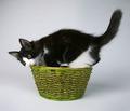
| 07/12/2003 09:16:14 PM |
Naked from Birthby arnitComment: good clear shot.. cute how the kitty is posed in the basket, and munching on a part of it! bet you're getting hammered for putting a kitty in the nude challenge.
I think it is a photograph that could sell well, and be used for many purposes though, so you should be proud of this achievement. |
| 07/12/2003 09:14:32 PM |
Recliningby magnusComment: the definition of the body created by the light is very nice - although perhaps a diffuser would have helped some areas from being shiny. Loss of DOF on the hip (?) - top right - keeps my eye in the center of the photograph.. where as my eye would like to travel along the curve, but it halted and brought back to center again. |
| Photographer found comment helpful. |
| 07/12/2003 09:11:43 PM |
Vintageby buzzrockComment: the proximity of the lens to the subject together with the crop has given the legs and abdomen an unreal enlarged effect. It does not do the body justice. Also, the focus is off, and lighting flat, leaving this to be unappealing. |
| 07/12/2003 09:05:21 PM |
Untitledby jenaromComment: nice shadows and skin tones. I also like the grain effect. it is sort of a mirror image type of photo, but I don't like the empty space in the middle, as it splits the image into 2 separate ones.. visually.
not abundantly interesting to view for a prolonged period of time.
|
| Photographer found comment helpful. |
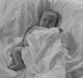
| 07/12/2003 09:03:17 PM |
my boyby jbruno1397Comment: what a great expression! and you also succeeded in getting great catchlights in the eyes. This is a wonderful portrait, and the b&w works well with it. |
| Photographer found comment helpful. |
| 07/12/2003 09:02:04 PM |
|
| Photographer found comment helpful. |
| 07/12/2003 02:23:08 PM |
Lay Lady Layby MikeOComment: How can I say this?.. please do not be offended ... photographically speaking, this is uninspiring. The angle does nothing for me. Lighting is terrific! Just the right amount and shows depth and body detail nicely. Focus could be sharper. |
| Photographer found comment helpful. |
| 07/12/2003 02:21:09 PM |
Mt. St. Judeby fleenkComment: a very strange image.. this is something perhaps falling in the "modern art" category. I never quite got into that, so it is not appealing to me.
Some parts out of focus, and lighting is quite flat. |
Home -
Challenges -
Community -
League -
Photos -
Cameras -
Lenses -
Learn -
Help -
Terms of Use -
Privacy -
Top ^
DPChallenge, and website content and design, Copyright © 2001-2025 Challenging Technologies, LLC.
All digital photo copyrights belong to the photographers and may not be used without permission.
Current Server Time: 08/14/2025 06:18:07 AM EDT.