| Image |
Comment |
| 12/08/2002 10:51:21 PM |
|
| 12/08/2002 09:53:58 PM |
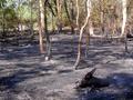
After Bush Fireby bayuComment: Initial: It took me a minute to understand the impact of this photo.
I think that a different angle would help me/the viewer fully appreciate what has occurred here. The smoking/smouldering log in the lower right corner isn't placed for impact. My eye goes directly to the bright spots of the trees, which leads me to believe there is no urgency or sadness to the photo. More of an edge of the green that didn't burn, in contrast to the black and burned areas would tell a stronger story.
|
| 12/08/2002 09:45:31 PM |
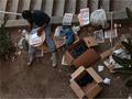
1 Bowl of Soupby MiekaComment: I have been asked to give an indepth critique on this photo for the critique club...I pretty much summed it up in my original comment during voting, but I will attempt to be more descriptive. :0)
--------------------------------------------------------------------
Initial: This photo makes me feel sorry for the person.
Composition: The framing and angle are excellent for this photo. He is in chaos, and the angle adds to this feeling.
Technical: I mentioned that boosting the brightness/levels a bit would benefit this photo... I said this because his face is in such shadow, and the overall tone of the photo is dark. Not too bright...just enough to bring out more detail.
I am left wondering what he is doing. Writing a list? What is going thru his mind?
Good catch, Meeks!
:0) |
| 12/08/2002 09:31:57 PM |
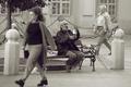
Do we care?by sahkoComment: Hi Sahko:
Initial: We've all seen this scene too many times, and have acted the same in as this as well. This is emotive; guilt feelings, sadness, pity, etc.
Composition: The scene composed itself. The subject.. the man sitting on the bench, is oblivious to the others and his surroundings. He seems used to being ignored. (how sad). Perfect timing to get the man to be giving that curious yet judgemental look, and to get the woman walking swifly past... almost urgently to get away from the area, and the guilt. Her eyes are cast down. She does't want to see it.
Colors & Quality: I think this would be stronger in Black & White. The brownish/sepia tone gives a classic/timeless look, where as the black and white would give it more of a dramatic/harsh feeling which goes with the mood of the photo. The focus/clarity could be a bit better, but otherwise, I would not change anything. |
 Photographer found comment helpful. Photographer found comment helpful. |
| 12/08/2002 09:18:27 AM |
Flower in Blue'mby connieComment: catchy title. interesting arrangement/set up. A little more dof would bring it to a sort of half-way point, and would possibly also darken the white background a bit so as not to be so washed out. |
| 12/08/2002 09:12:48 AM |
Cosmosby AleciaComment: Very interesting to look at. Love the blue sky and clouds as background. I can't decide if this gives me a feeling of stars reaching for the sky, or falling from the sky. Lots of twists keep my eye interested. |
| Photographer found comment helpful. |
| 12/08/2002 09:07:40 AM |
|
| Photographer found comment helpful. |
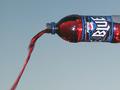
| 12/08/2002 09:06:32 AM |
? Blue ?by ppritcheComment: I'd like to see this flipped horizontally. My eye is tracing the line of the flow of liquid up to the bottle... but that seems crazy because it should flow down and out. Although, it is just as crazy that they named it blue, but it is red, so maybe the crazy effect adds to the paradox. Ok I'm rambling. |
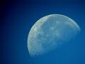
| 12/08/2002 09:03:38 AM |
Blue Moonby vtruanComment: gorgeous thru the telescope shot. .. although there is some vignetting on the left. Nice job still. |
| Photographer found comment helpful. |
| 12/08/2002 09:02:17 AM |
|
Home -
Challenges -
Community -
League -
Photos -
Cameras -
Lenses -
Learn -
Help -
Terms of Use -
Privacy -
Top ^
DPChallenge, and website content and design, Copyright © 2001-2025 Challenging Technologies, LLC.
All digital photo copyrights belong to the photographers and may not be used without permission.
Current Server Time: 08/15/2025 05:27:15 AM EDT.