| Image |
Comment |
| 11/01/2004 11:32:03 AM |
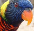
Brillanceby xtabintunComment: Nice sharp details of the feathers and beak. Contrast seems a bit flat or maybe feathers under the beak are really that light. |
 Photographer found comment helpful. Photographer found comment helpful. |
| 11/01/2004 11:30:33 AM |
Swimming Through Fall Colorsby alanfreedComment: Ducks are too centered. They could use some negative space in front of them and maybe above. Sharp details of the feathers and of the water. |
| Photographer found comment helpful. |
| 11/01/2004 11:29:08 AM |
Bartender, Another Please!by smokeditorComment: Vedry clean and crisp lines. The stop action of the fluid flowing out the of the bottle is very good and detailed. My main concern is with the white space above the bottle. I think that should have been cropped right up to the bottle. Excellent otherwise. 9 |
| Photographer found comment helpful. |
| 11/01/2004 11:26:29 AM |
Sylviaby joannsComment: Excellent portrait study. Nice soft details of the dress and her skin. I like how her hair flows downward past her shoulders and barely touches her. Lighting is also very good and emphasizes the tone of her skin well. 10 |
| Photographer found comment helpful. |
| 11/01/2004 11:24:15 AM |
In Studyby MadMordegonComment: Not sure I like the composition of this with all the distracting objects in the background and the two different colors of carpet. The papers also are overexposed. |
| Photographer found comment helpful. |
| 11/01/2004 10:37:11 AM |
Lost At Seaby vince31874Comment: There must be a very sad story behind this. Would have liked to see the dates better as I cannot make out the complete year of birth but I presume that he was young considering there's a stuffed animal on the post. Nice use of thirds. |
| 11/01/2004 10:35:02 AM |
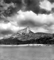
Cathedral Peakby PaigeComment: Very stunning b/w photo. Feels nicely balanced overall but I think it could use a just a bit less water to help increase emphasis on the mountain and sky. Clouds appear to be blown out in a couple of areas. |
| Photographer found comment helpful. |
| 11/01/2004 01:49:56 AM |
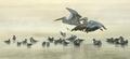
Fog Boundby duncesComment: Very nice stop motion study. Subtle fog effects seem to make the shot bright. Funny how I keep looking for the AFLAC duck. |
| Photographer found comment helpful. |
| 11/01/2004 01:29:29 AM |
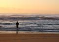
The Fishermanby dhareComment: Horizon does not appear to be level and the water on the sand seems to emphasize that fact. Good job of placing the person on the 1/3 mark. Sky appears to be overexposed. |
| Photographer found comment helpful. |
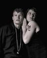
| 11/01/2004 01:28:08 AM |
On stageby JC_HomolaComment: Something about this photo feels artificial. I can see the texture of the woman's dress but the man's shirt looks odd and might be a result of excessive compression. Skin tones look strange even for a black and white shot. |
Home -
Challenges -
Community -
League -
Photos -
Cameras -
Lenses -
Learn -
Help -
Terms of Use -
Privacy -
Top ^
DPChallenge, and website content and design, Copyright © 2001-2025 Challenging Technologies, LLC.
All digital photo copyrights belong to the photographers and may not be used without permission.
Current Server Time: 08/20/2025 01:54:15 AM EDT.