| Image |
Comment |
| 01/18/2005 07:03:20 PM |
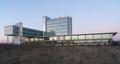
MediaLiMburgby messerschmittComment: This is a striking design study but the angle and distance make it have much less impact. If you were to concentrate on one aspect of the building and crop it just right, it would do very well. |
 Photographer found comment helpful. Photographer found comment helpful. |
| 01/18/2005 07:01:48 PM |
"Architecture of a Mining City"by SamTComment: Although nicely composed, this lacks punch and that cetain something that makes me say wow. Also, it appears to be very centered assuming your main focal point are the two rusted structures. Having said that, focus is good and colors are nice and saturated. No annoying bright spots. |
| Photographer found comment helpful. |
| 01/10/2005 02:37:14 PM |
Happy Days by qmdiComment: Great photo and congratulations on your ribbon! Great work and an amazing black and white. |
| Photographer found comment helpful. |
| 12/14/2004 08:16:02 PM |
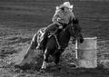
A Day At The Rodeoby SunnieeComment: This is a great action shot and amazing b/w to boot. I really like the soft lighting around the hat, arm/shoulder and leg. I wish that there was some cushion space in front of the rider but other than that it's an excellent photo. |
| Photographer found comment helpful. |
| 12/08/2004 08:31:55 PM |
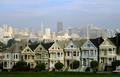
The Alamo Square Sevenby mirdonamyComment: Hi Arie!
So sorry I did not get to vote on your shot. You did a great job of interpreting the challenge with the seven row houses. The sky is a bit off as I can see red in the clouds. Contrast is nice and focus is fairly sharp. Too bad about the little bit of roof on the left side which interferes with the overall flow of one house to the next. Overall, great job and congrats on your high score! |
| Photographer found comment helpful. |
| 12/05/2004 06:24:25 PM |
Air Driedby soupComment: Nice sharp contrast and creative way to use the "handle" of the clothes pin to lead the eyes to the spring. I might have placed the "handles" a bit higher (or lower) so the spring rests on a 1/3 mark both horizontally and vertically. |
| Photographer found comment helpful. |
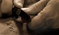
| 12/02/2004 06:14:17 PM |
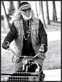
Sharpening a Carpenter's Pencilby Dr.ConfuserComment: Nice use of leading lines, or thumbs, to point the viewers eyes to the blade and pencil. The duotone is also a good choice. Focus is sharp. Although there is one issue I have with this and it's the light spot by the person's left hand. At first I thought it was my monitor but then I scrolled the web page and it lies within the photo. It looks like you dodged that area specifically and unfortunately, it loses lot of points. Other than that, it's a very nice shot. |
| Photographer found comment helpful. |
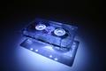
| 12/02/2004 10:16:45 AM |
Technology from the last Millennium!by WinterbergComment: Very good job with the spotlight and floating casette tape. Although I feel it has a bit too much negative space along the top, I can see this placing very high perhaps a top three finish. Good luck! 9 |
| Photographer found comment helpful. |
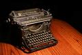
| 12/02/2004 10:14:04 AM |
Word Processorby kerrywcComment: I think this would have been perfect if there were more details of the typewriter and less of the table ledge on the right. I love the lighting although it is a bit bright (sharp shadows on the bottom). |
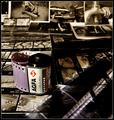
| 12/02/2004 10:11:19 AM |
The way it used to beby maelmsComment: Ahh yes...negatives and contact sheets...those were the days! Excellent composition and color. Contrast is also excellent. Nice touch with DOF. 10 |
Home -
Challenges -
Community -
League -
Photos -
Cameras -
Lenses -
Learn -
Help -
Terms of Use -
Privacy -
Top ^
DPChallenge, and website content and design, Copyright © 2001-2025 Challenging Technologies, LLC.
All digital photo copyrights belong to the photographers and may not be used without permission.
Current Server Time: 08/20/2025 01:54:11 AM EDT.