| Image |
Comment |
| 06/09/2004 08:51:10 PM |
Flamingosby rameviComment: Great subject but there are some things I would fix. 1. Back two flamingoes are overexposed. 2. Use a fill flash to help bring out details of the foreground flamino. 2. Clone out the branch hanging down from the top of the frame. |
 Photographer found comment helpful. Photographer found comment helpful. |
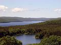
| 06/09/2004 08:49:18 PM |
Enfield Pointby amsmythComment: Great vantage point and composition. Colors appear a bit dull and the sky lacks contrast. Maybe a UV/Haze filter and levels adjustment might help. |
| Photographer found comment helpful. |
| 06/09/2004 08:47:36 PM |
Deep in Pollenby mrblobbyComment: Not quite deep DOF as the foreground and background petals are blurry. Excellent macro shot with nice details of the bee and the pollen. Almost makes me want to sneeze. :) |
| Photographer found comment helpful. |
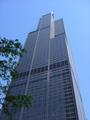
| 06/09/2004 08:46:05 PM |
Up, Up, Awayby ms_eagletteComment: Maybe it's my eyes but I don't see a lot of sharp details of the tree leaves or of the building (Sears Tower?). I see quite a bit of compression that hinders them. Color and composition are good starts and the bottom could be cropped just a bit to eliminate that odd bit sticking out of the building in the lower right. |
| Photographer found comment helpful. |
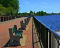
| 06/09/2004 08:43:36 PM |
Benches.. Benche.. Bench.. Benc.. Ben.. Be.. B.. Churchby mariomelComment: Great shot with details all the way back. Not sure if you tried it but if the POV was about a foot or so lower might give the benches and railing more impact. Also I might have tried a tighter crop (some off the left and right) to help with the vertical feel that you are trying to achieve with the vanishing point. Slightly oversharpened but won't deduct. 7 |
| Photographer found comment helpful. |
| 06/09/2004 08:39:41 PM |
"AND THEY SCORE" by tyt2000Comment: Originally posted by bradical:
I love the photo! Personally, I would have named it GOOOOOOOOOOOAAAAAAAAAAALLLLLLLL! Just a thought. |
LOLOL! I was thinking the same thing! |
| 06/09/2004 04:30:20 PM |
America's Favorite Pass-time by hgpayneComment: Very nice image but I see two flaws that would have prevented me from giving this a 10. First is that big white spot in the upper left corner. That is very distracting and should have been cropped out. The second flaw is not as major but is noticeable and that the image is slightly tilted towards the left. I do like the duotone/sepia look and I agree that it gives it a very timeless feel. Looks nicely focused and details are sharp. I would have given this a 7. Good job overall and congrats on your ribbon! |
| Photographer found comment helpful. |
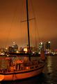
| 06/08/2004 01:37:10 AM |
untitledby highpriceComment: Some noise throughout the photo and focus seems just a tad off on the boat and considerably more on the buildings in the background. |
| Photographer found comment helpful. |
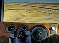
| 06/08/2004 01:35:49 AM |
Romeo 34 Bravo, taxi to runway 30, Altimeter 29.83by photomComment: Although hard to see details due to sheer distance, I'm assuming that the planes are in focus and giving you the benefit of the doubt. The foreground details have a feel about them that I just can't figure out. They look like highly detailed CGI output but I know they are not but they just have that feel about them. Very good interpretation of the challenge. 7 |
| Photographer found comment helpful. |
| 06/08/2004 01:28:44 AM |
Squire's Castleby indianzfanComment: Oversharpened and color balance seems a bit off. Lighting is also bright. The girl in the foreground looks like she was placed there just to provide a foreground focus point and not natural. Would look better if she had some interaction with another child to justify her position in the foreground. |
Home -
Challenges -
Community -
League -
Photos -
Cameras -
Lenses -
Learn -
Help -
Terms of Use -
Privacy -
Top ^
DPChallenge, and website content and design, Copyright © 2001-2025 Challenging Technologies, LLC.
All digital photo copyrights belong to the photographers and may not be used without permission.
Current Server Time: 08/22/2025 05:33:57 AM EDT.