| Image |
Comment |
| 08/02/2004 01:09:15 AM |
Glassesby Hye5Comment: Making sure your glasses are very clean is so important in a shot like this. Excellent composition and symmetry. The lint/specks in the second glass are distracting. |
 Photographer found comment helpful. Photographer found comment helpful. |
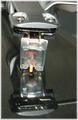
| 08/02/2004 01:07:49 AM |
Reflecting on Codes & Keysby Dr.ConfuserComment: Good attempt but there doesn't seem to be a single point of sharp focus. OK, maybe the lettering on the gray plastic card on the right but I doubt that is the main subject. Lighting is also very bright and harsh. |
| Photographer found comment helpful. |
| 08/02/2004 01:03:21 AM |
Primary Mergerby mcmurmaComment: Great use of DOF. I also really like the background as it lends nice touch of color to an otherwise colorless subject. Only thing I might have changed is maybe rotate the vessel a few degrees to the right so the bubble would not be visible. 8 |
| Photographer found comment helpful. |
| 08/02/2004 12:58:45 AM |
|
| 08/02/2004 12:57:46 AM |
Interesting Churchby pitsamanComment: This is definitely an interesting church however, I don't know if I'd consider it an everyday object unless you worked there. The tops of the church seem chopped off especially the second from the left. Photo seems a bit tilted to the right and it appears there is a bit of grain/noise throughout the image. |
| Photographer found comment helpful. |
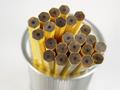
| 08/02/2004 12:53:50 AM |
Unsharpened Pencilsby webkingComment: Hey, I have a similar pen cup on my desk at work! Great shot and love the pencils. Exposure is a little bright but might be due to the background messing with my eyes. 8 |
| 08/02/2004 12:43:23 AM |
Home Stereoby The_WedgeComment: I really like the composition of this photo however it looks very over processed. I think if you kept the colors true rather than use an excessive amount of filters it would look much better. Maybe even as a b/w? |
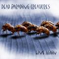
| 07/30/2004 03:43:25 PM |
Dead Parading Creaturesby ccaseyComment: This is just very wrong and gross. But from a creative standpoint I love it. Dead bugs and band name contrasting literally/visually is a nice touch. Lighting seems a bit off and even bright in some areas like the right side bugs. 7 |
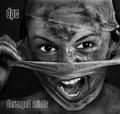
| 07/30/2004 03:15:17 PM |
DPC - Demerging Personality Conflict by kiwinessComment: This is another favorite of mine. Love the photo in b/w. It has very nice tonal range and contrast. The eyes Are a very strong focal point and they show lots of emotion. 10 |
| Photographer found comment helpful. |
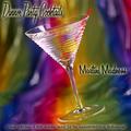
| 07/30/2004 03:12:27 PM |
Dinner Party Cocktailsby EddyGComment: Hands down my favorite of the bunch! Love the background and the typeface choices are perfect. I think that the glow you gave was a bit thick but perfect other than that. I give it a 9.5 but I need to round up to a 10 (too bad, huh?). :) |
| Photographer found comment helpful. |
Home -
Challenges -
Community -
League -
Photos -
Cameras -
Lenses -
Learn -
Help -
Terms of Use -
Privacy -
Top ^
DPChallenge, and website content and design, Copyright © 2001-2025 Challenging Technologies, LLC.
All digital photo copyrights belong to the photographers and may not be used without permission.
Current Server Time: 08/21/2025 01:58:00 PM EDT.