| Image |
Comment |
| 09/06/2004 01:25:51 AM |
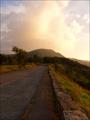
Sunset time in Shenandoahby AndrewTOComment: Although this is a nice sunset image, I don't feel inspired by the road/path. I would like to see more scenery instead of pavement. |
 Photographer found comment helpful. Photographer found comment helpful. |
| 09/06/2004 01:22:16 AM |
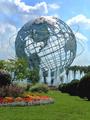
Out and About in New York City Areaby admart01Comment: Very nice composition overall. Focus is mostly clear. My only issue is with the exposure as it feels a bit bright especially with details blown out in the clouds. |
| Photographer found comment helpful. |
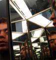
| 09/05/2004 05:00:02 PM |
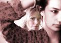
Risquéby mocabelaComment: Although I couldn't vote on the Nude II entries, I did go over them briefly. Comparing this outtake to the one you entered, I like aspects of both and would like to see them combined if possible. I like the facial expression of the one you entered and the position of your hands with the hair style and duotone of this one. Both are very good and you already have been told about the overexposed skin in the other so I won't belabor that. Excellent work! |
| Photographer found comment helpful. |
| 08/20/2004 01:15:11 PM |
katie-kirbie.jpgby theodor38Comment: Interesting poses and I like how the foreground girl's arm frames the face of the one in the background. The duotone is nice but it looks like it was a selective one since the background girl's face is still in color. Her hair is way overexposed and is a bit distracting. But I really like this one a lot and great work! |
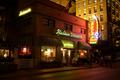
| 08/20/2004 01:09:29 AM |
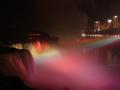
Niagara Falls Illumination by Resusit8uComment: Great idea and overall great photo. I would have cropped the bottom a bit tighter as the red mist is a very dominant aspect and distracts the eye from the colored spotlights. |
| Photographer found comment helpful. |
| 08/20/2004 01:01:45 AM |
Beautiful Noiseby eptasdiComment: I think this is my first 10 in this entire challenge. Love the colors, composition and focus! I think it would look better if it was brighter to help show off the neon but maybe you would have introduced noise or other unwanted fringe benefits. Great job and definitely a ribbon winner. |
| Photographer found comment helpful. |
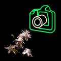
| 08/19/2004 10:41:00 AM |
Photographyby GabrielComment: I really want to give this photo a 10 but I can't. Did you add a thick black border to this image? If not, why are the flowers cut off and then there's empty black space at the bottom? That just looks odd to me. Excellent idea and execution. 7 |
| Photographer found comment helpful. |
| 08/19/2004 01:42:00 AM |
|
| 08/19/2004 01:40:51 AM |
Viva Italia!by alanfreedComment: This woould be more impressive if there was less building and more sign. |
| Photographer found comment helpful. |
| 08/19/2004 01:40:12 AM |
Temptationby coldaComment: Lots of compression as I can see banding in the yellow. |
| Photographer found comment helpful. |
Home -
Challenges -
Community -
League -
Photos -
Cameras -
Lenses -
Learn -
Help -
Terms of Use -
Privacy -
Top ^
DPChallenge, and website content and design, Copyright © 2001-2025 Challenging Technologies, LLC.
All digital photo copyrights belong to the photographers and may not be used without permission.
Current Server Time: 08/21/2025 04:53:04 AM EDT.