|
|
|
Showing 801 - 810 of ~1531 |
| Image |
Comment |
| 12/08/2003 01:07:16 PM | |
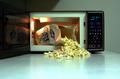
| 12/06/2003 02:21:22 PM | Mmmm....Popcornby CraigDComment: Greetings from the CC, well certainly an on topic subject. My immediate thought is that if you had cropped along the right side of the microwave you would of created a very interesting perspective looking into the microwave, focusing the viewer on subject a little more. I think I would of also cropped a little off the bottom to add to this subject enhancement. I think the light inside the micro really helped keep your shot from being underexposed inside the microwave. Your choice of having the popcorn spill out is very nice as well. Perhaps a little steam may have added something to the feel of scent. I likfe the sharpness of your shot also. Keep up the good efforts. |
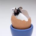
| 12/05/2003 11:27:53 AM | What's up? by sahkoComment: Greetings from the CC, obviously a loved shot and a deserved ribbon winner. I think you did very well to get the mouse to stay in that egg shell first of all. Of course it is a good shot as is, but here is my opinion what perhaps could improve it. The egg holder could possibly be black (or white) to give a more monochromatic color scheme matching the mouse or perhaps even cropped out, I find the large blue section a little distracting, then again you could try it in b&w also. The mouse could also be facing the camera, this I think would be the biggest improvement possible. Perhaps cropping a little more on the right moving the subject a bit more into that corner would make him seem like he has more room on the left to 'look into'. These are just some thoughts, to give something to think about, very nice job and congrats on the ribbon!! Well done! |  Photographer found comment helpful. Photographer found comment helpful. |
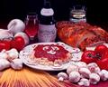
| 12/01/2003 12:30:21 PM | Eat at Tony's, it's the best.by bruskiComment: Greetings from the CC, seems like lots of folks think this is more advertising, but I will look more at shot itself, taking 'challenge topic' considerations out. I find the shot too small for one and very busy for a small space. It feels very crammed, making my unsure of what to focus on. I think a simpler less busy compostion may have served you better. I don't find the glass in the background at all neccessary, nor the slices of bread on the right side. The garlic on the left is a little overexposed. I wonder if you would try reshoooting with less objects and see if it comes together a little better. I do like the way that the uncooked spaghetti is presented on the table, and the plate of spaghetti itself. Perhaps these, and the wine would be enough to work with.
I think your idea is good, keep playing with it, maybe next time give yourself a little more time : ).
Hope it is helpful, if not disregard and keep up the good work : )
lynn CC
p..s. if you reshoot them send them to me if you like and i will have a look. | | Photographer found comment helpful. |
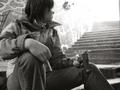
| 12/01/2003 12:20:47 PM | Why start smoking when you can take the easy way out!by DufusComment: Greetings from the CC, here is my input, if it helps great if not feel free to disregard... Your subject choice and message are both very powerful IMO, the age of your subject is poignant, the choice of b & w is very good, adding to the seriousness of the subject matter. Even your choices regarding background wall (refering to graffiti/ads, the position of subject at bottom of stairs looking up into light is very good.
My biggest objections would be I think that you could of cropped slightly more off the right, removing the (other wall?) from the top corner of shot. And while I like the brightness at top of stairs wishing there was slightly less 'brightness', it seems to draw my a little too much, taking away from the subject a little. I would like to be forced to consider the subject a little more and her 'choice' (perhaps this is not your intention).
Overall a very well done shot.
Keep up the good work
lynn CC | | Photographer found comment helpful. |
| 11/21/2003 09:39:06 PM | Waiting for the Sonby GraciousComment: I suspect this is a photoshopped version of your submitted one, I really like this one, even more than the first, it really gives a ground and a context to your clouds. Let us know what you did. : )
|
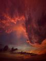
| 11/21/2003 11:24:36 AM | The Heavenliesby GraciousComment: Hi CC member here, I am new to the CC and feel a little threatened by critiquing your photo, a ribbon winner. It certainly deserves it, it is SO dramatic, the colors are stunning and warm, the cloud formation is spectacular and surreal almost. The only possible think I can think of that may add to your shot is if a bird was flying thru, then it gain it may distract from the beauty that is already there. I am curious what the small blackish area on bottom right is? perhaps could of cropped it out. It really is a well done shot. The way the clouds are coming down it has the feel that the heavens are trying to reach you as much as you they (and succeeding). I apologize for not having more of a critique to offer you. |
| 11/21/2003 12:48:20 AM | household Shinto altarby kenboComment: Hi new critique member here to give some thoughts on your shot, hope they help...
The tones in this are wonderful ranging the whole gammit, from black to white and lots in between. This is a feeling of quiet ond elegance that you have capture thru your lighting choices, overall I think this is a good image, and a creative subject (it is great to see varying takes on a topic!! : )).
My possoble criticisms would be it is very tightly cropped on the top, would be nice if there was a little more space up there. The central compostion could help to suggest the centralness of this sacred place to the photographers life.
My last thought is somewhat naive, this may be an exact representation of a Shinto altar, which if is this criticism is of questionable use, but the shot is a little crammed, it feels like their are a lot of objects in it to focus on, I think the b&W color scheme helps to unify it,some possible solutions could be to only include part of the altar or perhaps some additional black background space would really give it some breating space.
A good sharp, clear image, with great lighting and subject.
happy shooting
|
| 11/19/2003 10:37:30 PM | my sacred placeby agwrightComment: hi, one of the new critique members, here to give some thoughts on your shot....
positives, the bench the building and the lights on the water, the sharpness and stillness are wonderful here, certainly gives the feeling of contemplation and solitude. The light in the sky is really wonderful, even tho it is nighttime it has a brightness and warmth to it.
While I am left curious about the white reflection it does not interfere with the shot IMO as much as the branches on the right, I think cropping the 1/4 of the shot would rid that distraction as well as shifting the building and the bench to the right side (which your eye naturally goes to). It would also create a more standard vertical format. I think a reduction is the sides would help the eye to focus on the really great subject and light in the center of your shot.
nice work, happy shooting : )
CC | | Photographer found comment helpful. |
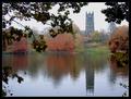
| 11/19/2003 04:25:03 PM | Reflecting Upon Religionby michael_pComment: Hi new CC member going to give you my thoughts I hope they help.
Things that work well in my opinion are: the colors of the leaves, the mood of the shot , i.e. fog. the building is composed nicely in rule of thirds. The reflection and the title work well together to fit the challenge while producing a good photo.
My criticism would be the leaves in the foreground I am not sure that they add to your main subject. They are quite dark and some what overpowering and distracting. I would like to see a comparative shot anyway without them. The other possibility is that with them gone you could add more contrast to the building helping to stand out a bit more. Also allowing to see a bit more of the fall colors in the distant trees. Just my thoughts--happy shooting.
CC
| | Photographer found comment helpful. |
|
Showing 801 - 810 of ~1531 |
Home -
Challenges -
Community -
League -
Photos -
Cameras -
Lenses -
Learn -
Help -
Terms of Use -
Privacy -
Top ^
DPChallenge, and website content and design, Copyright © 2001-2025 Challenging Technologies, LLC.
All digital photo copyrights belong to the photographers and may not be used without permission.
Current Server Time: 08/15/2025 12:47:45 AM EDT.
|