| Image |
Comment |
| 05/08/2003 09:55:45 AM |
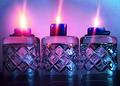
Burning Glassby loz1Comment: this image could be sharper and that would improve it quite a bit... it also appears to lean slightly left |
 Photographer found comment helpful. Photographer found comment helpful. |
| 05/07/2003 07:12:15 PM |
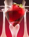
strawberry wineby bgaras2001Comment: wow! this is really cool..... I like the composition and the colour..... this gets a ten from me.... I really enjoy looking at this image..... couldn't ask for much more.... love the way you have lit the backdrop.... excellent! I think this will win! Good luck, Todd. |
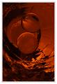
| 05/07/2003 04:09:21 PM |
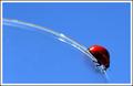
Round and Round by JackoComment: Strong visual, nice focus.... possibly a bit grainy or reddish spots in the blue.... but overall it's a well balanced image.... I think this will do well.... the blue and the red work well to create a nice contrast..... very good, hopefully the ladybug is made of glass too! I'm giving it a 9.... good luck, Todd. |
| Photographer found comment helpful. |
| 05/07/2003 04:05:41 PM |
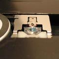
Clever Sliverby knightdComment: it may be clever but it's just possible that I'm not..... if that glass is in the far hole, the one that is in focus, then I can't see it.... if it's the round bit that's closer, then it's out of focus..... either way I don't think this is an overly strong image..... too much foreground and background and the round thing on the left is quite distracting too.... I'd be happy to discuss this with you after the challenge, maybe I'm missing something..... not sure...... good luck, Todd. |
| Photographer found comment helpful. |
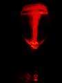
| 05/07/2003 04:00:05 PM |
Red Reflectionsby MarionHComment: not sure what I'm looking at but I like it. Good mood and balance.... can't fault it technically..... visually it's very strong..... okay, this is my first 10 for this challenge.... i think this should do really well.... good luck, Todd. |
| Photographer found comment helpful. |
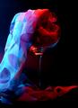
| 05/07/2003 03:57:12 PM |
Cascadeby AleciaComment: nice use of light.... the image stands up pretty well.... perhaps I would have blue lit the glass and red lit the scarf.... I think this would highlight the glass better and make for a stronger composition.... the eye is drawn strongly to the blue rather than the glass..... good luck, Todd. |
| Photographer found comment helpful. |
| 05/07/2003 03:54:09 PM |
Fire and Iceby severinComment: i think this is way too dark to be effective... I think it would have been quite a good shot but I would like to see the stem and the sides of the glass..... alternatively crop the base out.... but I think ligter would far stronger visually.... good luck, Todd. |
| 05/07/2003 03:51:39 PM |
|
| Photographer found comment helpful. |
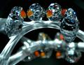
| 05/07/2003 03:50:49 PM |
Crystal Lovebirdsby willtataComment: nice idea..... it just needs to be a little sharper.... increase your depth of field, that should help solve this problem.... good luck, Todd. |
| Photographer found comment helpful. |
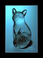
| 05/07/2003 03:49:25 PM |
Wild Blueby #1 Bronco FanComment: quite a good shot, I like the way the cat's head pics up the hot-spot in your lighting.... shadow and relection on the surface at the base detract somewhat from the overall effect.... good luck, Todd. |
| Photographer found comment helpful. |
Home -
Challenges -
Community -
League -
Photos -
Cameras -
Lenses -
Learn -
Help -
Terms of Use -
Privacy -
Top ^
DPChallenge, and website content and design, Copyright © 2001-2025 Challenging Technologies, LLC.
All digital photo copyrights belong to the photographers and may not be used without permission.
Current Server Time: 08/01/2025 06:19:05 AM EDT.