| Image |
Comment |
| 11/04/2007 12:38:59 PM |
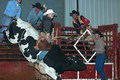
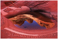
8 Secondsby moondogComment: Difficult at the best of times, however the composition and the white eye on the bull have let this image down. |
 Photographer found comment helpful. Photographer found comment helpful. |
| 11/04/2007 10:08:34 AM |
Let's take a rideby RodertComment: Greetings from the CC
=====================
First impressions: Love the light on the skyline
Composition: Seems balanced with the train in the lower third and the city taking up the rest of the picture. Enough space left in front of the train for movement. Including the S curve of the track helps lead the viewer through the photo.
Exposure: The sky and skyline are exposed well however the foreground is a bit dark and the whitebalance could use a bit of warming up. Shooting with it set to shade or cloudy (rather than auto) sometimes helps.
Impact: I think the darkness of the foreground has taken away from the impact of the image. Brightening up and possibly warming up the image would improve it.
The dynamic range in these types of images can be quite challenging to capture.
Keep shooting.
Colette |
| Photographer found comment helpful. |
| 11/03/2007 08:19:15 PM |
|
| Photographer found comment helpful. |
| 11/03/2007 06:39:55 PM |
Santa Babyby -Bec-Comment: Cute idea and the eyes do draw you in however, whatever process was used was over done. The eyes look too much like glass and the skin doesn't look natural. |
| Photographer found comment helpful. |
| 11/03/2007 06:35:26 PM |
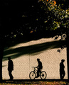
urban shadowsby tateComment: Nice idea however the trees at the top of the frame don't add anything to the image. I think it would work very well cropped to a square. |
| Photographer found comment helpful. |
| 11/01/2007 02:53:20 AM |
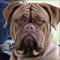
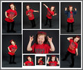
Take Me Homeby PhotologistComment: Nice expression. On composition though there appears to be something sticking out of his neck and the right ear is cut off. |
| Photographer found comment helpful. |
| 09/19/2007 08:55:32 AM |
|
| Photographer found comment helpful. |
| 09/11/2007 11:24:44 PM |
|
| Photographer found comment helpful. |
| 09/08/2007 12:28:02 PM |
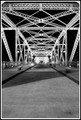
Crosswalkby ryandComment: The leading lines of the trusses and repeating pattern is good to draw the viewer into the image. However, the large amount of empty space at the bottom of the image adds nothing. Cropping out the part below the benches I think would give the image much more impact.
I probably would have given it a 5 in the challenge. If foreground cropped out then a 6. |
| Photographer found comment helpful. |
| 09/06/2007 07:47:47 PM |
|
| Photographer found comment helpful. |
Home -
Challenges -
Community -
League -
Photos -
Cameras -
Lenses -
Learn -
Help -
Terms of Use -
Privacy -
Top ^
DPChallenge, and website content and design, Copyright © 2001-2025 Challenging Technologies, LLC.
All digital photo copyrights belong to the photographers and may not be used without permission.
Current Server Time: 08/08/2025 06:11:28 PM EDT.