| Image |
Comment |
| 05/14/2003 12:45:12 AM |
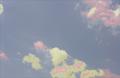
tulipby UberFishComment: Orange is a stronger colour than purple so for more impact I would have chosen an orange tulip as the center of attention for this image. IIf only one tulip were in focus (shallower DOF) it would add to the impact of the photo as well.
The image is exposed well but the main subject is too central. |
 Photographer found comment helpful. Photographer found comment helpful. |
| 05/13/2003 07:24:31 PM |
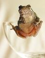
Got Till It's Gone by arnitComment: How many glasses did you have to break to get this one? I would have cropped the image slightly on the left to give more impact. Otherwise well done, 8. |
| Photographer found comment helpful. |
| 05/13/2003 07:13:45 PM |
Hard drive reflectionby xertionComment: I keep wanting to look at this sideways. Maybe it would be better rotated 90 degrees clockwise.
Otherwise very creative and well composed. I like it. |
| 05/12/2003 10:53:49 AM |
|
| 05/08/2003 08:41:49 PM |
|
| 05/08/2003 08:39:55 PM |
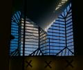
nude with glassesby ellamayComment: he he he........ Other than the attempt at comedy unfortunately this image does not have much in the way of impact. It does seem to be exposed properly but the windows are a little too central. |
| 05/08/2003 08:35:21 PM |
Let me out!by AprilTheatreGeekComment: he he he ......
A touch more depth of field would give the image more impact. As it is the background is an abstract painting and could be almost anything. |
| 05/08/2003 08:28:36 PM |
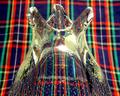
Vaseby KingLokComment: I like the look of the plaid through the glass and the perspective chosen for this image. the Plaid as a background is very distracting. This shot might have worked better in macro mode since it would be easier to really blur the background. |
| Photographer found comment helpful. |
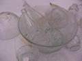
| 05/08/2003 08:26:41 PM |
lots of glassby tiffComment: The lighting is very flat therefore leaving the image with not much contrast. It also seems to have a magenta cast (maybe this was intentional). |
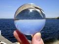
| 05/08/2003 08:23:13 PM |
Crystal Ballby PhoyoComment: The perspective on this is almost perfect . A little lower perspective and the horizon in the ball would have lined up with the horizon in the rest of the image. Also, if the ball had been placed on a stand of some sort to take the picture you would have had more options for vantage points. |
Home -
Challenges -
Community -
League -
Photos -
Cameras -
Lenses -
Learn -
Help -
Terms of Use -
Privacy -
Top ^
DPChallenge, and website content and design, Copyright © 2001-2025 Challenging Technologies, LLC.
All digital photo copyrights belong to the photographers and may not be used without permission.
Current Server Time: 08/04/2025 06:55:20 PM EDT.