| Image |
Comment |
| 07/07/2003 09:57:14 AM |
|
| 07/07/2003 09:54:59 AM |
GBV June 2003by Starbright1973Comment: I guess you might see the world this way if you were on speed. Interesting interpretation of the challenge. |
| 07/07/2003 09:52:52 AM |
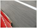
Travelin' 75by CLarson557Comment: Good sensation of speed is implied by this image. The white line in the top right is distracting. Did you try shots with more of the car and no white line? |
 Photographer found comment helpful. Photographer found comment helpful. |
| 07/07/2003 09:47:18 AM |
|
| Photographer found comment helpful. |
| 07/07/2003 09:39:11 AM |
|
| Photographer found comment helpful. |
| 07/06/2003 07:57:21 PM |
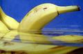
The SPLASH!by PHOTOCHlXComment: Exposure on the water seems ok. There are just a couple of hot spots. The composition doesn't work for me, I get no sense of speed. |
| Photographer found comment helpful. |
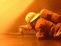
| 07/06/2003 07:30:06 PM |
Fireman At workby draney4Comment: *Critique Club*
General: Very good journalistic shot. Well captured.
[B}Composition: [/B] Good use of diagonal lines. The diagonal line created by the fireman draws the viewer in. Did you try other perspectives? i.e. having the sprinkler just a little more to the left
Exposure: There seems to be a slight loss of detail in the shadows. This could possibly be helped with a 1/3 of a stop more exposure.
Impact: The yellow glow adds impact. The only thing that would add more impact would be to include the fire he is fighting.
Colette
|
| 07/06/2003 09:11:31 AM |
149mphby tomlewis1980Comment: Interesting take on the challenge. The ball gives the impression of speed that always shows up in a tennis match. Did you try different angles (to show the racket more) or with the racket moving as well? This might have improved the impact for this image.
Exposure is bang on. |
| Photographer found comment helpful. |
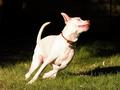
| 07/05/2003 09:59:53 PM |
113 Degrees Doesn't Slow Him Downby lynnesiteComment: Excellent attempt at capturing a difficult subject. For this challenge a slower shutter speed would give more of a sense of motion and speed. In this image only the left (from the dog's perspective) front paw is blurred. Also, more space on the right for the dog to move into would give the image more impact. |
| Photographer found comment helpful. |
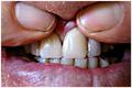
| 07/05/2003 09:55:50 PM |
oooooh.... this is gona be expensiveby timboydwhiteComment: *Critique Club*
General: This is a good attempt at a documentary shot. If this is what you were trying to accomplish then you succeeded.
Composition: The fingers are a bit distracting. Showing more teeth and concentrating on either the lower or upper set to emphasize a particular area could possibly improve the composition.
Exposure: In general the exposure is good. There is just one hot spot on a tooth on the upper right. This could probably be corrected by noting where the light is coming from and adjusting the angle accordingly.
Impact: Looking at someones teeth is usually not very appealing (except for a dentist). What might help is isolating one tooth. That said, for the purpose you propose in your comments you could probably succeed with this type of photo.
Colette |
| Photographer found comment helpful. |
Home -
Challenges -
Community -
League -
Photos -
Cameras -
Lenses -
Learn -
Help -
Terms of Use -
Privacy -
Top ^
DPChallenge, and website content and design, Copyright © 2001-2025 Challenging Technologies, LLC.
All digital photo copyrights belong to the photographers and may not be used without permission.
Current Server Time: 08/05/2025 01:55:45 AM EDT.