| Image |
Comment |
| 06/29/2005 10:04:05 PM |
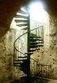
Forgotten: Fortress Stairwayby greignerComment: Bigger is better. Use the entire 150k and the 640 pixels on the longest side.
The railing makes a nice leading line up through your image however the bright spot at the top is quite distracting. |
| 06/29/2005 02:24:12 PM |
All That Glitters...by mesmerajComment: Overall I liked your creativity with this one. The placement of the lips etc. gives a good sense of what is happening in the image. The soft focus in the background works really well however I found the OOF foreground a bit distracting. |
 Photographer found comment helpful. Photographer found comment helpful. |
| 06/29/2005 02:10:04 PM |
Of Days Gone Byby cpanaiotiComment: Self Critique
Overall I liked the placement of the window handle and how the focus falls off behind it. I also liked the texture showing in the wood frame of the window.
It could use more light on the handle as has been pointed out in one of the comments received so as to bring out more of the detail of the handle.
Not much wow factor due to the lack of lighting. As it is I desaturated the colours that appeared in the background so the window frame and handle would stand out more.
|
| 06/29/2005 11:38:41 AM |
|
| Photographer found comment helpful. |
| 06/29/2005 10:28:58 AM |
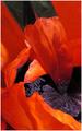
by greslizzzComment: By not providing a title you force the viewer to look closer. I'd say all but those who voted 4 and above did take a closer look. By presenting images without title if also forces the photographer to produce an image that is very clear in the message.
The message in this image is not that clear though the impression I got was 'Red Hot' or 'Sizzle'.
Keep shooting and keep trying without a title or if you choose to use a title try not to use it to lead the viewer but to give the image life/meaning (as you see it of course). Message edited by author 2005-06-29 10:29:26. |
| Photographer found comment helpful. |
| 06/29/2005 10:18:11 AM |
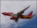
"A Little Southwest Color"by sfarrell23Comment: I think they were confused as to what paint colour to use so they just used all the leftovers from the other airlines (to save money).
It's a very colourful photo however the plane is trapped in the frame. More space on the left and the top would give it some space to fly into. |
| 06/28/2005 10:05:42 PM |
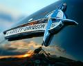
Hog Heavenby charmayneComment: Great perspective and positioning of the horizon in the reflection. I feel it needs just a little more DOF though since the word Harley is partially out of focus. |
| Photographer found comment helpful. |
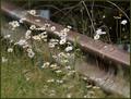
| 06/28/2005 09:54:17 PM |
guarding these daisiesby coolharComment: I like the composition and the choice of DOF. This I believe would work very well with selective desat keeping only the daisies in colour. |
| Photographer found comment helpful. |
| 06/28/2005 09:28:49 PM |
|
| Photographer found comment helpful. |
| 06/28/2005 09:17:52 PM |
|
| Photographer found comment helpful. |
Home -
Challenges -
Community -
League -
Photos -
Cameras -
Lenses -
Learn -
Help -
Terms of Use -
Privacy -
Top ^
DPChallenge, and website content and design, Copyright © 2001-2025 Challenging Technologies, LLC.
All digital photo copyrights belong to the photographers and may not be used without permission.
Current Server Time: 08/10/2025 01:32:42 AM EDT.