| Author | Thread |
Comments Made During the Challenge  |
|
|
07/05/2005 05:14:41 PM |
|
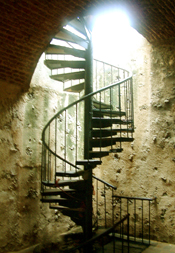
The light beams from top combine with the ladder give a really good effect =) |
|
|
|
07/05/2005 01:15:06 PM |
|
would have liked to see this bigger |
|
|
|
07/05/2005 12:47:27 PM |
|
The bright light at the staiway top is very distracting. |
|
|
|
07/05/2005 12:16:01 PM |
|
Very nice, can I bet money on a ribon? |
|
|
|
07/05/2005 09:53:32 AM |
|
|
|
07/05/2005 04:10:22 AM |
|
excellent....But unfortunately it's low resolution... |
|
 Photographer found comment helpful. Photographer found comment helpful. |
|
|
07/04/2005 11:53:37 PM |
|
small images have a hard time getting votes i've found. the light coming from the top is a bit overpowering. |
|
| Photographer found comment helpful. |
|
|
07/04/2005 07:31:41 AM |
|
It looks like it's a very nice picture, but because of the very small size, it's hard to really judge. |
|
| Photographer found comment helpful. |
|
|
07/03/2005 07:30:12 PM |
|
Although there is a size limitation I think it would be better to stick with the higher end limits. |
|
| Photographer found comment helpful. |
|
|
07/03/2005 05:23:55 PM |
|
|
|
07/03/2005 01:17:34 PM |
|
Nice use of lines, I think the light at the top needs to be dodged just a bit. |
|
| Photographer found comment helpful. |
|
|
07/03/2005 11:30:47 AM |
|
It seems to be an excellent photo ... |
|
| Photographer found comment helpful. |
|
|
07/03/2005 12:41:46 AM |
|
cool photo - wish it were larger. |
|
| Photographer found comment helpful. |
|
|
07/02/2005 09:40:35 PM |
|
This looks like it could be a really good photo if only it were a little bigger. |
|
| Photographer found comment helpful. |
|
|
07/02/2005 05:27:17 PM |
|
Strive for a larger picture.. it will really help. Interesting captue. |
|
| Photographer found comment helpful. |
|
|
07/02/2005 04:27:19 PM |
Dang, I was looking forward to seeing this one full size. It seems to have so much potential, but much, much too small. Check out this tutorial on sizing your shot for DPC. Focus on keeping your longest dimention at 640 pixels.
//www.dpchallenge.com/tutorial.php?TUTORIAL_ID=26 |
|
| Photographer found comment helpful. |
|
|
07/02/2005 04:00:11 PM |
|
I wish this image was bigger. It's a tough photo because of the backlighting. I do like the austererity of the subject.7 |
|
| Photographer found comment helpful. |
|
|
07/02/2005 01:04:39 AM |
|
I fear that this is a fantastic image which will be under appreciated because it is so small. Next time, if you can, try to use all the pixels available to you. |
|
| Photographer found comment helpful. |
|
|
07/01/2005 08:10:37 PM |
|
This could have been so much better if it weren't so small. Great shot. |
|
| Photographer found comment helpful. |
|
|
07/01/2005 04:05:54 PM |
|
Too small of a picture to see the detail. I am new to this site and have just entered my first pic. I read the tutorial under the learn link and it showed me how to get the largest and most clear pic and still fit in the confines of the contest. More than likely everyone else is going to say this as well, but hopefully this is helpfull. Looks like a great shot though just needs to be a little bigger. |
|
| Photographer found comment helpful. |
|
|
07/01/2005 01:06:33 PM |
Wish this was bigger, it has all the earmarkings of a great image but impossible to evaluate at this javascript: do_vote(4)
4 size 4 |
|
| Photographer found comment helpful. |
|
|
07/01/2005 05:10:06 AM |
|
|
|
07/01/2005 03:05:50 AM |
|
Arghhh you missed the part where it says 640 pixels any which way..welcome to DPC and put a bigger photo next time, I'm not going to vote you down for this otherwise fine image... |
|
| Photographer found comment helpful. |
|
|
07/01/2005 12:34:07 AM |
|
This is a great photo and has soooo much potential. 2 things, first off and most obvious, it really needs to be larger. 2nd, obvious as well, the light portruding from the whole; this cant be in the photo because it is very distracting to the image. Also, but not a huge factor, I cant find the connection between 'Obsolete' and this photo. Overall though, this has a lot of potential... 6 |
|
| Photographer found comment helpful. |
|
|
06/30/2005 11:47:12 PM |
|
I think this is probably a good shot - the light looks really interesting. Try to get your image as large as DPC allows though, so others can really see the photo. |
|
| Photographer found comment helpful. |
|
|
06/30/2005 07:11:20 PM |
|
This looks like an amazing shot! If it were larger and could see detail it probably would have helped out. |
|
|
|
06/30/2005 03:46:44 PM |
|
You need to check some of the threads/tutorials on how to upload a picture. This picture is way too small to score fairly. |
|
|
|
06/30/2005 12:27:17 PM |
|
out of focus, top highlights blown out |
|
|
|
06/30/2005 12:16:54 PM |
|
Gee I wish this was bigger. It looks really cool, but I have to squint. |
|
|
|
06/30/2005 09:30:44 AM |
|
this looks like a nice shot, but too small to really get an idea. check the tutorials on preparing your entry for challenges |
|
|
|
06/30/2005 08:39:09 AM |
|
Would have rated higher if it was larger showing more detail. 6 |
|
|
|
06/29/2005 10:04:05 PM |
Bigger is better. Use the entire 150k and the 640 pixels on the longest side.
The railing makes a nice leading line up through your image however the bright spot at the top is quite distracting. |
|
|
|
06/29/2005 08:30:15 PM |
|
|
|
06/29/2005 07:44:32 PM |
|
Nice subject. Lighting is good except for the spot at the top. Would of liked to see this a little bigger. |
|
|
|
06/29/2005 06:14:42 PM |
|
Too small, and seriously overblown highlight washes out the top third of the stairwell. |
|
|
|
06/29/2005 04:08:28 PM |
|
Image is too small and a bit too centered. |
|
|
|
06/29/2005 11:28:59 AM |
|
this would have been an excellent entry but for two thing...harsch lighting at the top of the stairs( shorter shutter or later in the day would have fixed this) and small photo posted(read tutorial //www.dpchallenge.com/tutorial.php?TUTORIAL_ID=26 to prepare photo for challenges) the comp for this is great..maybe try a tripod becasue from what i can tell it looks(to me) like a slight camera shake from too slow a shutter. i hope this helps..if u have any questions please pm me after the challenge and i will try to help more...good luck and have a great day |
|
| Photographer found comment helpful. |
|
|
06/29/2005 10:04:55 AM |
|
Oh, I would have loved to have seen this larger! It looks like it would be a great setting. A little overexposed at the top though. |
|
|
|
06/29/2005 08:54:04 AM |
|
This (imo) would have been so much better if it was bigger and the bright light at the top wasn't there. Neat idea though |
|
|
|
06/29/2005 07:40:17 AM |
|
Too small - need to use the full 640 pixels |
|
|
|
06/29/2005 07:13:02 AM |
|
too small for good detail |
|
Home -
Challenges -
Community -
League -
Photos -
Cameras -
Lenses -
Learn -
Help -
Terms of Use -
Privacy -
Top ^
DPChallenge, and website content and design, Copyright © 2001-2026 Challenging Technologies, LLC.
All digital photo copyrights belong to the photographers and may not be used without permission.
Current Server Time: 06/29/2026 05:20:47 PM EDT.