| Image |
Comment |
| 07/16/2005 10:47:42 PM |
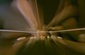
Bounce, Bounceby benlarcombeComment: Interesting abstract though for a sports challenge I would have liked to see something in the frame to provide context. This may have been accomplished with a little more definition in the blurred areas. |
| 07/16/2005 10:44:42 PM |
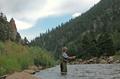
Fly High in Rocky Mt. National Parkby jasonarmComment: composition: 4 - main subject is too central, the left bank of the river adds nothing to the composition. Include less left and more right
Exposure: 5 - lighting is flat and the image appears to be under exposed, not enough contrast
impact: 5 - neutral
Overall: 5 |
| 07/16/2005 10:41:34 PM |
Fly Fishermanby mysticredComment: Composition: 7 - seems to work though there are some distracting elements (bright rocks and OOF branches in foreground)
Exposure: 5 - doesn't seem well balanced, rocks and man's clothing are too bright and the colours seem washed out
Impact: 5 - neutral
Overall - 5 |
 Photographer found comment helpful. Photographer found comment helpful. |
| 07/16/2005 09:33:46 AM |
|
| Photographer found comment helpful. |
| 07/16/2005 09:31:48 AM |
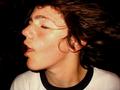
getting hit unawareby benlenzComment: Good expression and sense of movement however if the fist were shown in the picture and the zoom was a little less the message would come across much better. |
| 07/16/2005 09:28:54 AM |
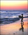
by kaske666Comment: The colours are good and the silouhetted figure seems well placed however there is a lot of colour noise in the sky and the horizon has a very noticable tilt. |
| Photographer found comment helpful. |
| 07/16/2005 09:25:15 AM |
The Glory Daysby EvanHComment: Colours and silouhetted person work really well together however the placement of the person doesn't feel right. To me he should be on the right side since he's looking left. This would make the image feel more dynamic as the person would have space to look into. |
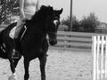
| 07/16/2005 09:23:22 AM |
As Oneby emilyoliveComment: The headless horse person. I like the contrast though there could even be a bit more as the horse doesn't show much detail. the composition doesn't feel right with all the cutoff body parts. |
| 07/16/2005 09:21:40 AM |
|
| Photographer found comment helpful. |
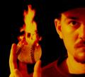
| 07/15/2005 10:09:27 PM |
Bring the Heatby The_ItinerantComment: I very much like the composition though I'm not too sure about the processing. A little too much yellow and red applied. |
| Photographer found comment helpful. |
Home -
Challenges -
Community -
League -
Photos -
Cameras -
Lenses -
Learn -
Help -
Terms of Use -
Privacy -
Top ^
DPChallenge, and website content and design, Copyright © 2001-2025 Challenging Technologies, LLC.
All digital photo copyrights belong to the photographers and may not be used without permission.
Current Server Time: 08/13/2025 04:06:02 AM EDT.