| Author | Thread |
Comments Made During the Challenge  |
|
|
07/19/2005 07:20:39 PM |
|
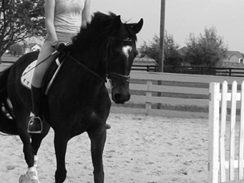
I think that there is not enough detail in the black. The horse looks out of focus and the cropping doesnt do it for me. Nice try though. |
|
|
|
07/18/2005 02:44:37 AM |
|
Interesting crop. Not sure if I like it or not. First impression is bad photo, but maybe there's more to it. |
|
|
|
07/18/2005 12:33:03 AM |
|
why is the rider headless? bad crop or bad shot? would like to see the original. |
|
|
|
07/17/2005 08:53:23 PM |
|
Good image. I think some of the details have been lost and the harsh cropping leaves the image incomplete. Judi |
|
|
|
07/17/2005 07:51:11 PM |
|
Horse too dark lacks detail and I think the rider's head should be in shot. |
|
|
|
07/17/2005 09:17:34 AM |
|
Would have been much better if the head was not cut off. |
|
|
|
07/16/2005 10:04:43 AM |
|
It's a nice photo but I just feel that the composition could have been better. With the riders head cut off it really seems as though there is something missing IMHO. I just can't help looking up in search of a face. |
|
|
|
07/16/2005 09:23:22 AM |
|
The headless horse person. I like the contrast though there could even be a bit more as the horse doesn't show much detail. the composition doesn't feel right with all the cutoff body parts. |
|
|
|
07/16/2005 05:45:56 AM |
|
Don't like how her head is cut off. |
|
|
|
07/15/2005 10:15:43 PM |
|
composition could be much stronger. including the riders' head would improve the shot greatly. cropping out the fence or composing the shot to not include the fence would help too. |
|
|
|
07/14/2005 09:37:35 AM |
|
i don't really like this shot becauseof the black and white effect, it's not really a sport and it' out of focus |
|
|
|
07/14/2005 06:56:55 AM |
|
|
|
07/13/2005 11:39:00 PM |
|
I'm not a fan of the choice in cropping, and would have liked more detail in the horse. |
|
|
|
07/13/2005 11:32:27 PM |
|
i think if we saw the persons head it would be better. just my opinion 5 |
|
|
|
07/13/2005 04:15:17 PM |
|
Too chopped off, both the horse and rider. |
|
|
|
07/13/2005 03:48:12 PM |
|
Not sure why you chose to amputate the girl's head here...? |
|
|
|
07/13/2005 03:06:57 PM |
|
The picture probably would have been better if the person's head and the horse's feet weren't cut off. |
|
|
|
07/13/2005 01:01:03 PM |
|
I think this would be better if the rider's head was included in the shot. |
|
|
|
07/13/2005 10:54:09 AM |
|
like this alot though a tad grainy-7 |
|
|
|
07/13/2005 09:41:55 AM |
|
I like the idea, but the horizon is off and the fence to the right is distracting. Maybe a different crop? |
|
Home -
Challenges -
Community -
League -
Photos -
Cameras -
Lenses -
Learn -
Help -
Terms of Use -
Privacy -
Top ^
DPChallenge, and website content and design, Copyright © 2001-2026 Challenging Technologies, LLC.
All digital photo copyrights belong to the photographers and may not be used without permission.
Current Server Time: 06/27/2026 05:32:49 PM EDT.