| Image |
Comment |
| 07/25/2005 08:51:29 PM |
|
 Photographer found comment helpful. Photographer found comment helpful. |
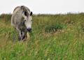
| 07/22/2005 02:01:41 PM |
Irish Horseby tazzaComment: Nice shot. You made the white sky work with this composition. |
| Photographer found comment helpful. |
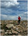
| 07/22/2005 12:04:11 PM |
As Fast As You Canby CutterComment: Great colour and contrast however (there's always a however) the horizon line is too central and cuts the runner in half. A lower vantage point to get the runner more against the sky or wait a second to get her at the top of the rise. |
| Photographer found comment helpful. |
| 07/22/2005 11:03:23 AM |
dare to knock?by saintaugustComment: Composition: I like the idea and the two shapes, door area and window area, complement each other. However, the framing is too tight at the bottom and on the left. Also, the perspective is a little skewed probably due to the angle you chose to shoot at.
Exposure: Seems a little underexposed and the lighting is quite flat. Also, the colours seem a little drab. Maybe that's how they are but to get the image to pop I feel the yellow needs to be more saturated and there needs to be more contrast to bring out the texture of the stone.
Impact: A little due to the choice of subject however not enough to hold a viewer for more than a couple of seconds. |
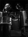
| 07/22/2005 10:44:20 AM |
brew houseby saintaugustComment: Interesting shot. From the angle you've chosen it looks like to tin men looking down to see who's taking the picture.
The image may be slightly underexposed (though could just be this crappy monitor at work.) |
| Photographer found comment helpful. |
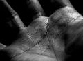
| 07/21/2005 05:06:37 PM |
Palmistryby wsteynComment: What works: the diagonal placement of the hand and the lighting of the part of the palm just below the fingers.
What doesn't seem to work: DOF seems a bit shallow. Seems a bit underexposed despite a couple of hot spots. The corners are a bit dark. It could be that it is too much of a closeup. |
| Photographer found comment helpful. |
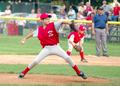
| 07/20/2005 05:09:18 PM |
DPC 2.jpgby ltb2738Comment: Very dynamic image. You've captured the pitcher's expression very well. |
| Photographer found comment helpful. |
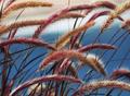
| 07/20/2005 04:47:29 PM |
soft or prickly?by inspir8tionComment: Composition: Feels quite dynamic though maybe a bit too busy. The white band near the top is slightly distracting though does follow the flow of the grass. 6
Exposure: Seems ok though maybe a touch overexposed. Some small areas appear to be a bit too bright. 6
Impact: Has a relaxing feel though I think a little less grass and maybe a sense of movement would would increase the appeal. 6
Overall: 6
|
| Photographer found comment helpful. |
| 07/20/2005 03:42:01 PM |
Texture? What texture?by speedylixComment: Composition: The crop feels a little too tight with his hind leg and wings cut off by the framing. Position of the wasp gives a rather static feel to the image. More or and angle and possible more head on would provide a more dynamic capture. 4
Exposure: Seems bang on. 10
Impact: Doesn't really grab me in any way. 4
Overall: 6 |
| Photographer found comment helpful. |
| 07/20/2005 11:17:21 AM |
The seatby harrisxanComment: Composition: Good use of diagonals to add interest. With the lines of the strands I don't know if a straight on view gives the best perspective. However, some sense of depth is obtained from the weave. 6
Exposure: Even though the texture and pattern of the strands can be seen quite clearly the image seems to be a little under exposed. 6
Impact: The pattern is interesting though not enough to keep the viewer's attention for more than a few seconds. 5
Overall: 6 |
| Photographer found comment helpful. |
Home -
Challenges -
Community -
League -
Photos -
Cameras -
Lenses -
Learn -
Help -
Terms of Use -
Privacy -
Top ^
DPChallenge, and website content and design, Copyright © 2001-2025 Challenging Technologies, LLC.
All digital photo copyrights belong to the photographers and may not be used without permission.
Current Server Time: 08/14/2025 06:17:14 AM EDT.