| Image |
Comment |
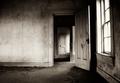
| 07/26/2005 08:40:27 PM |
The Closet.jpgby dustin03Comment: I like the tones and the mood though I feel it would be better if the center door was closed and out of the way. |
 Photographer found comment helpful. Photographer found comment helpful. |
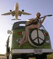
| 07/26/2005 05:07:19 PM |
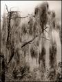
Peace and Quiet? by ColeyComment: Leavin'.... On a Jet Plane
Don't know when I'll be back again...
I can just hear her singing this song. |
| Photographer found comment helpful. |
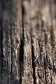
| 07/26/2005 04:11:11 PM |
cracked old timberby mrr1Comment: Composition: Though I like the idea I feel that the image is out of balance. This could be corrected with a small increase in DOF so the top of the image isn't quite so out of focus or by cropping some off the top. 7
Exposure: To me it's almost right. The sliver in the right third of the image has blown highlights. Since it is in the area of sharp focus the blown highlights are a distraction. However the texture in the rest of the area of strong focus has been brought out very well. 6
Impact: The texture of the wood is what creates the impact for this image though I think it could be improved if more of it were in focus. 6
Overall: 6 |
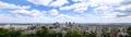
| 07/26/2005 03:49:17 PM |
Montreal-Skyline-Pan.jpgby pidgeComment: On the whole the composition works quite well. The buildings on the right lead the eye into the image and the pattern in the clouds does the same while giving the image depth.
Two things though: tilted horizon and more contrast between the buildings and the surroundings would make the image pop.
PS. Anything east of the rockies can only be classified as a hill. ;o) |
| Photographer found comment helpful. |
| 07/26/2005 12:57:15 PM |
Red and Yellow Hydrantby Rook3000Comment: Composition: Overall good placement though maybe a little too close or the crop slightly too tight on the left. 6
Exposure: Though the colours look true to life and the texture is quite visible in the peeling paint I feel the lighting is a bit flat. More lighting across the subject would help emphasize the texture but also give life to the subject. 5
Impact: Neutral. In addition to the lack of light I feel the impact is lost with the shallow DOF. The bottom 1/3 of the image is out of focus and I feel this takes away from the image. 5
Overall: 5 |
| Photographer found comment helpful. |
| 07/26/2005 12:52:03 PM |
The Drapery Fallsby aboutimageComment: Composition: Nice lead in with the tree on the left however the lower 1/3 of the photo seems rather cluttered due to lack of contrast. Also, the crop at the top is a bit tight. 5
Exposure: The intent may have been to generate a gloomy mood however the image feels a little under exposed and lacks contrast. No true white or black. 5
Impact: Some impact is generated by the choice of subject though more could be achieved if there was more overall contrast. 5
Overall: 5 |
| Photographer found comment helpful. |
| 07/26/2005 11:29:38 AM |
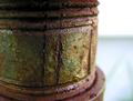
Pipeby arsenalComment: Composition: Seems to work with the placement of the main subject however the bright negative space is distracting. The eye almost always will gravitate to the brightest area of an image. Also, cropping slightly on the left may balance the image better. 6
Exposure: Despite the bright negative space I feel that the image is underexposed. More light on the main subject I believe would help as this would bring out the texture more. 5
Impact: Unfortunately, due to the bright negative space and lack of light on the main subject a lot of the potential impact of this shot is lost. 5
Overall: 5 |
| Photographer found comment helpful. |
| 07/26/2005 11:24:20 AM |
Tree Barkby scampComment: Composition: The mixture of light and dark work well due to the placement of the individual pieces of bark however the brightest piece is a little too central. It may have worked better if that piece were on more of an angle. Also, the DOF seems a bit too shallow as some parts of the bark are out of focus. This may only be a distraction due to its position in the composition. 6
Exposure: Ok though the lighting is very harsh making it difficult to get a balance between the highlights and shadows. 5
Impact: Impact is lost due to the harsh lighting. More subtle lighting that enhances the detail I think would have worked better. 5
Overall: 5 |
| Photographer found comment helpful. |
| 07/26/2005 11:14:39 AM |
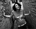
Rugged To The Touchby Joey LawrenceComment: Composition: Great angle though I feel a wider field of view is needed to add depth. One distraction - the person's shirt since the tones are brighter than other areas of the image. 7
Exposure: Seems bang on. Plenty of contrast and the texture of the bricks has been captured well. 10
Impact: The angle of the shot is what creates the impact here and does the job quite well though I feel a wider field of view would add to the impact. 7
Overall: 8 |
| Photographer found comment helpful. |
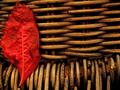
| 07/26/2005 11:09:25 AM |
one leaf leftby shotComment: Composition: good placement of the vertical and horizontal lines though the leaf is a little close to the left and top edges. Also, the leaf seems to take up too much space in the image. A wider field of view I think would improve the image. 7
Exposure: Seems ok though I feel a touch more luminance is needed since the lighting feels a bit flat. 6
Impact: This is where the image works well due to the texture of the chosen subject. More light/luminance would only make it better. 8
Overall: 7 |
| Photographer found comment helpful. |
Home -
Challenges -
Community -
League -
Photos -
Cameras -
Lenses -
Learn -
Help -
Terms of Use -
Privacy -
Top ^
DPChallenge, and website content and design, Copyright © 2001-2025 Challenging Technologies, LLC.
All digital photo copyrights belong to the photographers and may not be used without permission.
Current Server Time: 08/14/2025 06:14:18 AM EDT.