| Image |
Comment |
| 10/30/2003 02:07:40 AM |
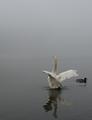
Reflecting Ritualby ellamayComment: Excellent subject, definitely graceful! I am impressed with the negative space at the top, the placement of the swan and it's reflection. My only wish is that the duck wasn't in the image. Overall a very nice image. Have you tried converting this to B&W yet?
Quadrajet |
 Photographer found comment helpful. Photographer found comment helpful. |
| 10/30/2003 02:04:09 AM |
Graceful Riderby GinaRothfelsComment: Ahhh..."The Grace"...I see. Although I understand the point of the subject, I don't feel it it's all that interesting.
Some suggestions for improving the image:
1. Try shooting this at night or with more dramatic lighting.
2. This image looks like it was shot from a car or possibly from across the street. Try shooting from a different angle, maybe get down a bit lower and shoot down the sidewalk or up one of the poles.
I hope this helps,
Quadrajet |
| Photographer found comment helpful. |
| 10/30/2003 01:55:47 AM |
Heaven's Graceby dcanoComment: You chose a prime subject for this contest, for that I give you props. I really like the lighting on the statue, there are just enough highlights to contrast with the shadows, creating nice depth and texture.
The halo seems like it might be a bit much for this image. I see what the idea was, and it's a good idea, but I'm not sure it works for me in this instance.
I wish the image was larger.
Nice shot, I hope this helps.
Quadrajet |
| Photographer found comment helpful. |
| 10/30/2003 01:49:45 AM |
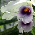
Orchid - backlitby JC_HomolaComment: I can see how this image would be considered graceful, so I won't comment on the subject itself.
The first thing I noticed when viewing this shot was how dark and...I hate to use this word but...dull...the image was overall. The second thing I noticed was that big green stalk/leaf thing at the bottom of the image.
A few suggestions for improving this image:
1. If you didn't use a fill flash, I suggest giving it a try for a backlit image like this. If you did use a fill flash, you may want to increase your flashes output by a stop or two, whatever it takes.
2. If possible, try to get rid of anything that could possibly clutter the background with high contrast objects. This not only detracts from the subject but brings the background into play when looking at an image. If it is impossible to get rid of the background clutter, creating a shallow depth of field (via larger aperture) can blur the background a bit, minimizing the backgrounds impact.
I hope this helps,
Quadrajet |
| Photographer found comment helpful. |
| 10/30/2003 01:23:34 AM |
Shipping graceby SinisterComment: I can see how someone would interpret this subject as being graceful. I don't really think of this when I think of grace, but that won't affect my voting.
I like the overall color of the image as well as light on the water and the cranes in silhouette. IMHO, the tree in the foreground seems to destroy the serenity of the golden water.
I also feel the street lights on the left side of the image as well as the power line towers on the right (the 2 fatter ones) could stand to be cropped out of the image.
I hope this helps,
Quadrajet |
| Photographer found comment helpful. |
| 10/30/2003 01:13:54 AM |
when she sleepsby sergutComment: Interesting choice of subject. If I had just zipped through the voting I probably wouldn't have picked up on the graceful curve of (I'm assuming it's a her) her wrist.
I'm not entirely sure if the low key does it for me, but I will say that it sets a particular mood for the image...one of "asleep".
The composition is fairly interesting if not lacking a bit for dynamics...but then again, she's asleep...how dynamic is that? LOL
Overall, I like this image, nice interpretation of the theme!
Oh and BTW, I don't feel the grain hurts this image one bit. |
| Photographer found comment helpful. |
| 10/30/2003 01:04:19 AM |
Coup de Grâceby GeneralEComment: I really don't know what to make of this image. I'm pretty sure that in the background is a woman (or man with long hair) resting her/his head on his/her folded arms. I'm trying to figure out what that pole is doing going across the image. Unfortunately it doesn't really seem to help the composition any. As a matter of fact it seems to destroy any semblance of continuity the image had going for it in the first place.
The colors are pretty bland, while the contrast is very high. The highlights are washed out and it's hard to make out detail in the dark portions of the shot.
I'm sorry, this is not one of my favorite images in this contest.
Quadrajet |
| Photographer found comment helpful. |
| 10/30/2003 12:58:39 AM |
Heaven's Breathby BBBastetComment: Great subject, fantastic location and clouds, not to mention your exposure is right on. The crepuscular rays are of course what gets the "ooh's and ahh's" but I particularly like the landforms and the hint of orange sky in the background.
My only critique of this image would be the plants in the foreground...they seem to break up the serenity of the sky and landscape, of course this in strictly my opinion.
I hope this helps,
Quadrajet |
| Photographer found comment helpful. |
| 10/30/2003 12:54:44 AM |
Grace and Powerby freeride21aComment: Nice shot, very graceful image! I like how the pattern they're flying and where they're composed makes it look like they're bouncing off the top of the image frame.
Technically, some of the smoke appears to be overexposed to the point where there is considerable detail loss. Compositionally, I feel there is just a bit too much negative space on the right side of the shot...(the planes are practically centered in the image).
I hope this helps,
Quadrajet |
| 10/30/2003 12:51:52 AM |
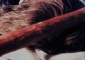
Hand Shakeby egantComment: Hmmm, I'm sure you'll probably get a few of these, but, I don't feel this image personifies grace. Of course you, as the photographer, probably think it does, and that's good enough for me...I'll vote with that in mind.
Technically, the exposure appears to be pretty darn close on most of the shot. Where the thumb and the web of the thumb overlap it's a bit overexposed. The composition is obviously fairly simple and straightforward, nothing too elaborate. Overall, it seems as if this was more of an experiment in strobe photography than in trying to compose a shot personifying grace. |
Home -
Challenges -
Community -
League -
Photos -
Cameras -
Lenses -
Learn -
Help -
Terms of Use -
Privacy -
Top ^
DPChallenge, and website content and design, Copyright © 2001-2025 Challenging Technologies, LLC.
All digital photo copyrights belong to the photographers and may not be used without permission.
Current Server Time: 08/04/2025 12:32:49 AM EDT.