| Image |
Comment |
| 04/18/2007 01:11:48 AM |
|
 Photographer found comment helpful. Photographer found comment helpful. |
| 04/18/2007 01:10:51 AM |
Channel Islandsby TomComment: two words... wow, and, woah!, the red on green below blue thing, really drew my attention. good job |
| Photographer found comment helpful. |
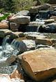
| 04/18/2007 01:09:41 AM |
Park Waterfallby obisgrlComment: Not too shabby, i know nothing about shooting water, but i think you might get a more desireably photo by decreasing shutter speed to give that popular washed out look... and is that a hint of a brick wall in the back? could be better, (but it is better than i could do...) i rate a 7 |
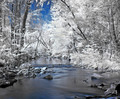
| 04/18/2007 01:07:12 AM |
Distant Snowby PoobaComment: i like this, kinda like most photos on this site, but this one is very nice. good crop and good detail in the sky. bravo |
| Photographer found comment helpful. |
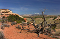
| 04/18/2007 01:06:21 AM |
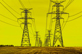
Towersby bmartuchComment: Tell me that the color of the sky in your world is blue, or somthing similar! this reminds me of the wizard of Oz... and my self living in the west i can relate... i vote a 7.0! |
| Photographer found comment helpful. |
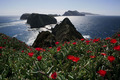
| 04/18/2007 01:04:45 AM |
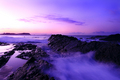
Secrets Of The Seaby BootsComment: Very nice... was the purple natural? and in the distance is that a city i see? Great Detail, Great color. gets my vote! good Job... |
| Photographer found comment helpful. |
| 04/18/2007 01:03:34 AM |
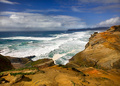
Cape Kiwandaby JeffDayComment: Hey! nice photograph, Did you use a polarizing filter? if not, it would help bring out some more detail in your sky, if so... well, i would use two? ha, i dont know a whole lot about polarizers, but i do know they work wonders for theese types of scenes. I like this though and rate it 7... |
| Photographer found comment helpful. |
| 04/18/2007 12:59:27 AM |
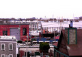
A Rendering of the Pier from a Rooftopby mfimanComment: A little messy and looks to me like it was way over processed, or i have my monitor on 16 colors,. In my opinion, i would have prefered this with a little more natural feel and less of a pastel paiting feel. but thats my own personal feelings... im not sure if i should rate it 1 for poor or 10 because i have spent so much time looking at it... and well, isnt that the objective of a image, to grab someones attention a little more than others... to balance my conflicting opinions, i give a 7... |
| 04/17/2007 07:10:46 PM |
|
| Photographer found comment helpful. |
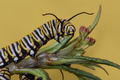
| 04/17/2007 07:09:53 PM |
Butterflyby LoreneComment: you could benifit by moving a little closer, or putting the insect on a rule of thirds, but i know how difficult that is... good job though, i rated this above 7 but below 10... :P |
| Photographer found comment helpful. |
Home -
Challenges -
Community -
League -
Photos -
Cameras -
Lenses -
Learn -
Help -
Terms of Use -
Privacy -
Top ^
DPChallenge, and website content and design, Copyright © 2001-2025 Challenging Technologies, LLC.
All digital photo copyrights belong to the photographers and may not be used without permission.
Current Server Time: 08/04/2025 07:50:51 AM EDT.