| Image |
Comment |
| 10/22/2003 04:35:12 PM |
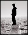
Daydreams from the edgeby ChezComment: A little grainy, but I think it works in this particular case. I think I would have actually cropped some off the bottom to remove all traces of the sand and some of the unfocused board. |
 Photographer found comment helpful. Photographer found comment helpful. |
| 10/22/2003 04:31:20 PM |
Alone no more...by bruskiComment: Powerful image, I like the use of negative space and the crop. The colour choice is also very effective. |
| Photographer found comment helpful. |
| 10/22/2003 04:24:40 PM |
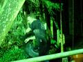
from the fridgeby 4h20Comment: I gotta say I don't really get whats going on in this image, and the title actually adds to the confusion.. Obviously I'm missing the point. I think I probably would have cropped out some of the distracting angles at the edges of the image and I'm not sure about the colour choice... but again this may have something to do with the story which I'm not understanding. |
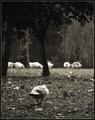
| 10/22/2003 04:22:30 PM |
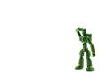
Where is Everybody?by paynekjComment: Cute little guy. I'm impressed with the lighting and the "positioning" of the subject - he's definitely alone. |
| 10/22/2003 04:21:39 PM |
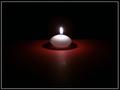
Playing with lightby TavaszkaComment: Technically, this is a great shot as I'm sure you had some difficulty getting the lighting just right, and obviously this image meets the challenge. From an interest perspective for me personally, I'm not really feeling it. However 2/3 is not bad. |
| Photographer found comment helpful. |
| 10/22/2003 04:18:56 PM |
|
| Photographer found comment helpful. |
| 10/22/2003 04:18:13 PM |
Sunday Seclusionby melongrindComment: Generally I like when an abundance of negative space is used in an image (especially in a challenge such as this one) However because the space is actually very busy, I think I would have cropped more of it out in this case. I do like the colours used, and the overall feel of the image. |
| Photographer found comment helpful. |
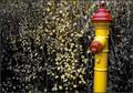
| 10/22/2003 04:16:44 PM |
Lifetime sentence of solitudeby finnurComment: You know it's funny the bright colours of the hydrant make this almost a happy picture, but then the hydrants downwards "expression" makes me want to think it's sad. Like a life sentence to look happy, and feel sad.. Interesting picture, I like it. |
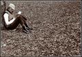
| 10/22/2003 04:14:43 PM |
Left Behindby jmsetzlerComment: I had to laugh a little when i saw this, the birds posture is excellent, looks just like a kid in the playground who is looking down, shuffling his feet because he has no one to play with. B&W was a good choice for this. My only improvement would be to try to make the other birds in the background look a little less blown out. |
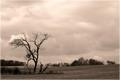
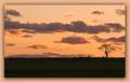
| 10/22/2003 04:12:10 PM |
A Treeby yeamg4Comment: Great colours I love the simplicity of this image. The border I actually think takes away from the overall effect, but that's just my personal preference. |
| Photographer found comment helpful. |
Home -
Challenges -
Community -
League -
Photos -
Cameras -
Lenses -
Learn -
Help -
Terms of Use -
Privacy -
Top ^
DPChallenge, and website content and design, Copyright © 2001-2025 Challenging Technologies, LLC.
All digital photo copyrights belong to the photographers and may not be used without permission.
Current Server Time: 08/01/2025 06:16:07 AM EDT.