| Image |
Comment |
| 12/01/2004 08:00:37 AM |
Mother Russia, 7-in-1by docpjvComment: The color cast is a bit off for me. The green is overpowering, and causing a slight hue shift on the reds. You might want to try tweaking the levels a bit. :) |
 Photographer found comment helpful. Photographer found comment helpful. |
| 12/01/2004 07:14:04 AM |
Gaming Nostalgia x7by racerraulComment: No Asteroids? What's up with that! I miss my Atari...As for the shot, lighting is okay, but the use of your couch as the backdrop isn't adding anything to the composition. It's actually taking away a bit due to the seam. Very cool idea though. |
| Photographer found comment helpful. |
| 12/01/2004 07:12:25 AM |
Made In Chinaby alanbataarComment: Nice idea, but the DOF in this case is a bit too much. You loose drill bit #7 into the blur. I'd also like to see a slight rotation of the leading bit so I can read a bit more of the text. |
| Photographer found comment helpful. |
| 12/01/2004 07:10:08 AM |
Left oversby thommoComment: Excellent use of frame within a frame. I might have positioned the bowl a bit more centered, but it's not overly distracting. I'd love to see this reshot with a nice set of chopsticks (mayve red?) and carefully measured out. This is a very cool shot! 9 |
| Photographer found comment helpful. |
| 12/01/2004 07:07:13 AM |
Breezy Dayby Mark of SRQComment: I like the crop in this shot. The last tree on the right not being smack on the corner of your crop job is nice. Beautiful shot, and looks like a great day to play camera! |
| Photographer found comment helpful. |
| 12/01/2004 07:03:06 AM |
Chinese Lanternsby whatdewucComment: Nice strong composition. The color feels off somehow. It might just me that I'm expecting to see a red lantern, and I'm seeing them orange. The crop on the lower left corner is also a bit tight for me. Last but not least the lighting on lantern #5 (from the left) is a bit hot. Not sure if this is accident or design. It's just enough brighter that it draws my eyes to that point. Overall nice job! |
| Photographer found comment helpful. |
| 11/24/2004 01:23:55 PM |
Light, shade, line, texture and cat.by LuxvichComment: Kitty! I actually really liked this shot. I'm a cat person by nature. The thing that actually makes this work is the negative space. For me it gives kitty a sense of scale.
And I liked the title too. :) |
| Photographer found comment helpful. |
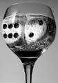
| 11/23/2004 09:14:17 PM |
Dice Cubesby DCThiessenComment: My 10 for the challenge. I like the tones, and I like the whimsey of the shot. The glare is a bit harsh on the glass, but the visual impact overrides that for me. 10 |
| Photographer found comment helpful. |
| 11/23/2004 10:40:05 AM |
Ask Notby strangeghostComment: I had no clue this was a mannequin! Excellent job! I really liked the feel of the shot. It make me think for an instant that I was in Vietnam. Very, very well done. I gave it a 7 during the challenge. |
| Photographer found comment helpful. |
| 11/23/2004 10:38:34 AM |
The Marshallby L1Comment: Nice job hitting top 10! You rock. :) On the technical side, I think sepia might have been a better coloring choice for the subject. But that's just me. :) |
| Photographer found comment helpful. |
Home -
Challenges -
Community -
League -
Photos -
Cameras -
Lenses -
Learn -
Help -
Terms of Use -
Privacy -
Top ^
DPChallenge, and website content and design, Copyright © 2001-2025 Challenging Technologies, LLC.
All digital photo copyrights belong to the photographers and may not be used without permission.
Current Server Time: 08/06/2025 01:23:52 AM EDT.