|
|
|
Showing 301 - 310 of ~915 |
| Image |
Comment |
| 04/14/2004 11:53:56 AM | Smashby novetanComment: Nice motion capture, bet you only had one go at this one! |
| 04/14/2004 11:50:24 AM | York's City Wallsby BobsterLobsterComment: Difficult lighting conditions, sky is overexposed and the ground is underexposed. If we could blend layers, exp. bracketing would do the trick. Maybe too much contrast done? |  Photographer found comment helpful. Photographer found comment helpful. |
| 04/14/2004 11:47:45 AM | Help Meby arnitComment: Nice lighting, post processing is great! |
| 04/14/2004 11:46:53 AM | Strong coffeeby neehaiComment: Great idea! Nice crop as well. The white balance/hue is a bit strange though, looks pink to me. |
| 04/14/2004 09:30:03 AM | Racing to the top!by kosmikkreeperComment: *** Greetings from the Critique Club ***
Glad I got this pic to comment on, it's a good one indeed.
Challenge
Since it's a free study, it fits the challenge very nicely. Furthermore, since you could do what ever you liked, coming up with such an original idea really shows what the free studies are all about, this one sticks out.
Composition
You've done a good job on the composition on this one, the space between his feet and the bottom of the frame, and the space on the right gives the viewer the impression he's in mid air and going very fast! Must have been very hard to catch the right moment on this one (I presume he's really jumping), you really did a good job (must have been fun to work on this as well). White background gives the photo a kind of surreal feeling, and was a much better choice IMHO than with a "real-looking" background.
Lighting
Now there is a challenge, catching the texture and tone of the suit, case and paper with a totally white background and probably a very well lit background, you did a great job on it. Two or three pages of paper might have been one tone darker to seperate it from the background, but considering the conditions it's done very nicely. Dark suit show great detail and texture, and you can see every bend on the pages as well! I'd love to see the setup on this one, I could learn a great deal of it.
Camera work
Great stop-motion, no blurring what so ever, and everything in focus as well (shows what good lighting can do). Job well done.
Post-Processing
This is probably the only thing I can critisize, there are a bit of "jagging" where the dark suit contrasts with the background. Your jpeg is as large on the longer side of it, but the image is only 60kb. Maybe if you would have saved with less jpg compression you would ged rid of the jaggies. Good B/W, nice contrast, everything else is perfect.
Title and Info
The title is very descriptive, and gives the image a bit of story around it in only 4 words, simple and effective. Info you gave is also good, but for photo-nerds like myself it would be fun to see the lens used (and at what focal length if zoom), and better yet on a unique (at least on DPC) setup like this it would be fun to see snapshots of the studio and session to see how things are done (not neccesary, just would be a fun bonus)
Overall (my opinion)
Super job, fun shot, an excellent idea for free study. This whole thing has been more a compliment than a critique... I think the march free study had a lot of great shots, and this was one of the better ones, could have finished 1st if you had asked me.
Best regards, Tyrkinn
| | Photographer found comment helpful. |
| 04/14/2004 06:57:15 AM | The Fly in the Bushby ImablessedComment: *** Greetings from the Critique Club ***
Hi, these are my thoughts of your "The Fly in the Bush" entry:
Challenge
Since this is a free study, your shot surely fits the challenge. The entry is however not a very original one IMHO, flowers and flies on them are a very common subject on the pages of DPC, and I think it lacks a bit of "wow-factor" to be a really interesting shot.
Composition
In this photo the fly is the main subject, but in my opinion it's too close to the edge. Putting it a bit more to the left and maybe a tiny bit lower would make it a more dominant factor in the frame. It does not help that you took composed the shot differently and cropped a small section out, if you would have composed the shot with the fly in mind you would probably position it differently, the entry looks a bit like it was composed differently when it was taken.
Lighting
Being an outdoor shot (and probably not planned ahead) the light is a bit hard to arrange. Shadows are a bit harsh, although they are not completely black which is good. Some kind of reflector (a white board maybe) or the use of fill-in flash would soften the shadows a bit to make them a smaller factor in the shot (flash can do amazing things in harsh sunlight). Cloudy days are easier to manage (softer shadows)
Camera work
Unfortunately you shot the pic differently first and that causes a few problems. For one thing, you loose resolution when you only use one corner of the captured image. Also, the very edge og the frame is usually a worse spot than spots more towards the middle. Focusing on things on the edge is a challenge as well. Focus seems to be a bit of a trouble with this shot, both the red/pink flowers in the foreground and the fly seems a bit blurry. Unfortunately I cant see your aperture and shutter settings, but a smaller aperture (larger F-number) would probably help to make a larger depth of field and hence the fly and the plants could all be properly focused. (magnetic9999 made a great tutorial about Depth of field: //www.dpchallenge.com/tutorial.php?TUTORIAL_ID=1 )
Post-Processing
This photo looks like its pretty much unedited, except for the crop. Small adjustments in photoshop or similar software could have helped a bit. Maybe some sharpening could have helped, and levels would have helped as well (maybe even auto-levels that you can find in most editing software).
Title and Info
The title is descriptive, but could maybe be more creative for my taste. The Photograph information is lacking, it's always a good idea to include at least the Aperture, ISO and Shutter settings that you can find in exif info (can see in most browsing software, probably in programs that came with your camera). It's good that you explained what you did with the cropping, it gives you a better idea how the image was shot.
Overall (my opinion)
I think that if you intended to shoot the fly at the beginning you would have made a better shot. The flowers look better than the fly in this crop, and altough the title indicates the fly is the subject the photo does not show it well enough. Something extraordinary is missing to make the shot rememberable. A different angle might be good, shooting from the right sight making the flowers be the background and the fly in the forground is one idea, then you wouldn't need more DOF, a shallower DOF would maybe be better if the angle was different. It's always a good idea to keep the weeks challenge in mind when shooting, you might see something that really fits the task.
Hope this helps you, keep shooting and submitting.
(please excuse the spelling and grammar, english is not my native language)
Best regards, Tyrkinn | | Photographer found comment helpful. |
| 04/13/2004 12:29:11 PM | What is Out of Place?by roveriComment: *** Greetings from the Critique Club ***
Challenge
I would say the image fits the challenge but just barely, I am not that surprised to see a yellow flower amongst purple ones (don't know the names of these flowers in english). Maybe some other object would stick more out amongst the smaller flowers. It also looks like it is a last-minute entry, not a very original one and it does not look like you've spent too much time on it either.
Composition
I like the filling of the frame on this shot, it isolates the subject in a nice way and it doesn't distract the eyes away from the whole point. Putting the yellow flower away from the middle would do the shot good in my opinion, especially in this challenge since the yellow flower is supposed to be "out of place", moving it towards one corner would make the point stronger in my opinion. Applying the "rule-of-thirds" might work nicely (here is a nice tutorial by jmsetzler: //www.dpchallenge.com/tutorial.php?TUTORIAL_ID=5), or maybe just to one side if you like that more. I would have cropped it tighter as well to exclude the brown thingy below the yellow subject thats distracting IMHO.
Lighting
I agree with some comments below, the lighting is a bit harsh, it's not bad but maybe if it was diffused a bit it would serve the image better, a reflector of some kind on the right side would remove some of the shadows or better yet, if it would have been a bit cloudy it would have served the shot better, the shadows and the very bright violet flowers contrast makes a bit messy.
Camera work
Good job on the settings, sufficient shutter speed and a small aperture gives the image all the DOF needed (everything in focus) and no movement. ISO is low, but there is something grainy-looking about it, I can't put my finger on what it is (It could be post-processing, what software did you use?).
Post-Processing
Looks like it is not processed much, which is good IMHO. Colors are good, a bit more saturation could work if not over applied, and the yellow color puts the "out of place" into the entry. Again, the grainy or furry over all look doesnt work for me, maybe post processing could have cleaned it up a bit (Neatimage could work?).
Title and Info
Title might be more original, including the name of the challenge is seldom a good idea if you ask me, makes it sound "shue-horned". Standard info is nicely filled out, I really don't like it when people skip entering the info like aperture, ISO and such. Would like to see something in the comments area, like what you did in post processing (all exif is nice but not needed), and maybe a small story around the shot.
Overall (my opinion)
The entry is a bit average and not very original in my opinion. It looks nice, but something extraordinary is needed to pull up the score, something more creative. I think the challenge was a bit hard this time so a lot of thought would have to be put in it to make shots fit the challenge and be great looking as well, I think you did o.k., very nicely when you consider it is only your second entry here at DPC. Keep sending them in!
Hopes this helps in some way, good luck in the future (excuse my english.
Best regards, Tyrkinn Message edited by Manic - fixing the url. |
| 04/01/2004 11:46:58 AM | little man on the runby muckpondComment: Very nice capture, a different approach to a portrait. The DOF gives the image the so called "wow-factor" IMHO. Posture gives the feeling of running, and it looks like you got just the right fraction of a second and focus on this one. Supershot, should go on your wall. [edit: my number 2 pick in a very good challenge] | | Photographer found comment helpful. |
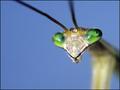
| 04/01/2004 11:12:59 AM | Mantisby sleekrComment: I know it's hard to do, but this one needs the extra 1mm of DOF, since only one eye is in focus. Well done though, crop is great, and background is totally neutral. | | Photographer found comment helpful. |
| 04/01/2004 11:06:41 AM | | | Photographer found comment helpful. |
|
Showing 301 - 310 of ~915 |
Home -
Challenges -
Community -
League -
Photos -
Cameras -
Lenses -
Learn -
Help -
Terms of Use -
Privacy -
Top ^
DPChallenge, and website content and design, Copyright © 2001-2025 Challenging Technologies, LLC.
All digital photo copyrights belong to the photographers and may not be used without permission.
Current Server Time: 12/14/2025 06:23:22 AM EST.
|