|
|
| Image |
Comment |
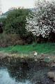
| 01/25/2003 04:00:33 PM | Newhall Parkby cvhs99Comment: Critique Club comment :o)
Composition:
The first thing that strikes me about this photo is that it feels slightly lopsided - the lines of the roof and the base of the hedgerow both slant down to the left, so perhaps a rotation of this shot would have helped.
The focal point of the shot seems to be cat and the treestump (which I first thought was another cat) by the water's edge. However, they're too small to make out any detail, so there's nothing really to look at, so maybe a closer crop/zoom or a different angle would have helped.
From what I can tell, the bank comes down the righthand edge of the frame (and just out of it) towards the bottom of the shot - if you'd taken this shot a few feet to the right and got this in frame, the curved line of the bank would probably lead the eye more smoothly through the image. Alternatively, shooting from a different angle a good few feet away could give some depth and lines to the hedge, which would be useful in leading into the focal point.
Background:
My personal opinion about landscapes is that buildings should either be out of shot, or be an integral part of the image - the roof in shot here is quite distracting, so perhaps a lower shooting angle could have hidden it behind the hedge.
Camera Work:
The focus and DoF on this shot is good. However, since you've not included your Aperture / ISO / Shutter settings, I can't say much more on this.
Post Processing:
Since you've not provided any details, I can only guess as to the post processing you've done, if any. One important thing to mention is that this shot is only 68Kb, out of a maximum 150Kb, therefore you may have lost quite a bit of detail by compressing the image down to that size - I always recommend that you try to get as close to the 150Kb line as possible, so that as little detail as possible is lost.
This shot feels in many ways like some of the ones I've taken on gloomy days round where I live - unless you're trying to emphasise that gloominess, I'd advise that you increase the saturation and play about with the levels to get more contrast into the shot, and make it feel a bit warmer. Its also worth converting shots to b&w, to see if they work better that way - I suspect that this shot could be one that does.
My Opinion:
I think that this is a potentially reasonable photo, but its let down by the composition and muted colours. There also feels like a lack of depth to the shot, since that hedge is flattening the background. As for the "Landscape" challenge, this photo meets it, but doesn't do anything more than that.
If you have any questions about this critique, please feel free to contact me via the PM system. |
| 01/25/2003 03:39:43 PM | Rugby: Ballet for Blokes.by catpixelComment: Critique Club Comment :o)
Composition:
The positioning of the players within the frame is great, and it definitely capures the moment well. The framing and wide aspect crop helps a lot, as it draws the viewers' attention to the players. Unfortunately you'd can't see the ball in this shot, so it makes it slightly trickier to work out what's going on at first glance - viewers will probably either be drawn in by this mystery, or pass over it.
Background:
With this sort of action shot, it's always difficult to control what exactly ends up in the shot when you take it. The background is probably a bit too busy, since it distracts from the players - perhaps a different position or angle would have helped, but since you're in a busy Central Park, its hard to say :o)
Camera Work:
I'd guess that this shot was was taken using full zoom, and probably digital zoom too - I personally never use digital zoom, since it lowers the quality of the shot and gives you less control than just cropping it afterwards. The focus on the players is good, but perhaps a shallower DoF would have helped blur the background a bit, making the players stand out more.
Post Processing:
Since you've not provided any post processing details, I've no real idea if you've done much to this shot. One important thing to mention is that this shot is only 86Kb, out of a maximum 150Kb, therefore you may have lost quite a bit of detail by compressing the image down to that size - I always recommend that you try to get as close to the 150Kb line as possible, so that as little detail as possible is lost.
One suggestion I have for this shot would be to play about with the saturation & colour balances, since this shot could probably do with being a bit more green and a little less blue, which would make it seem a little warmer and improve the contrasts a bit (even if it wasnt a warm day ;o).
My Opinion:
I'm a Brit myself, so I know what Rugby is :o) Out of curiousity, do you know if they were playing Rugby League or Rugby Union? Anyway, this is a good action shot, well composed, and as such I quite like it. However, it's definitely borderline as to whether it meets the "humor" challenge, and is only really saved by the title. Overall I'd rate it as an above average shot, but its not right for the challenge.
If you have any questions about this critique, please feel free to PM me about it. |  Photographer found comment helpful. Photographer found comment helpful. |
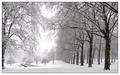
| 01/20/2003 06:06:15 AM | Snowscapeby ManicComment: For those of you who wondered what the thing on the left is, I went back to the same location a week later, and took this photo - it turns out to be a very oddly shaped waterfeature! :o) Final addition - it's in fact the Canadian War Memorial... so now you know! Message edited by author 2003-03-16 12:05:10. |
| 01/17/2003 01:47:12 PM | |
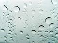
| 01/14/2003 07:47:12 PM | Rain Drops Keep Falling on My...by rj324Comment: Critique Club Comment :o)
Composition:
The most obvious thing about this shot, on first glance, is that there is no main focal point, and since there is nothing in the near background to reflect in the raindrops, this image becomes more of an abstract. Since you'd have had little control over where the raindrops actually were on the glass, I'd have tried to get a shot where a group of droplets lead the eye across the frame.
Background:
The background on this shot is an usual light greeny-turquoise. Considering that you're trying to sell the 'raindrops' aspect of this image, perhaps a more "stormy" colour would have helped here, such as a darker blue.
Camera Work:
The most obvious "fault" about this shot is the focus, since the corners (especially the lower left) are out of focus. This is probably due to your choice of F stop, since F2.2 leads to a very shallow DoF. Also, since you state that this was a car window, the probably angled or curved glass would exaggerate this. While shallow DoF is good in many instances, as it can draw the eye into one area of the image, the lack of a focal point to this shot means that it just feels confused. There's also a dark patch in the very bottom left corner that could easily have been cropped out.
Post-processing:
Since you've not provided any details, I can only guess as to the post processing you've done, if any. One important thing to mention is that this shot is only 48Kb, out of a maximum 150Kb, therefore you may have lost quite a bit of detail by compressing the image down to that size - I always recommend that you try to get as close to the 150Kb line as possible, so that as little detail as possible is lost.
My Opinion:
The idea behind the shot was reasonable, but the odd focus and lack of any real focal point really drags this shot down, which I think is reflected in the final score. Since all photos in this particular challenge had to use the title to sell the shot, I can't complain about that. This shot just about meets the challenge, but it lacks any interest.
If you have any questions about this critique, please feel free to contact me via the PM system. | | Photographer found comment helpful. |
| 01/14/2003 06:20:27 PM | Brahm's Lullabyby karmatComment: Critique Club Comment :o)
Composition:
Photographing a child is obviously quite tricky, since there is little that you can do to get them exactly how you want - catching them while they're asleep is probably as good a time as any ;o) It's a pity that your crop wasn't a touch taller, since you've missed off the end of the child's left hand. In addition, a slight change of camera position, more up and to the right, could have positioned that left hand more on the same vertical line as the child's eyes, plus the line of the arm would have lead the viewer's eye across the shot nicely. As its currently positioned, it doesn't do this as well as it could. I'd also suggest that you try flipping the shot left<->right, as ths can sometimes help lead the eye from the topleft corner (the natural start point) into the image.
Background:
The solid black background means that the child is the only point of interest in the shot, and provides a reasonable contrast. However, the lack of texture to the surface makes it hard to work out where exactly the child is asleep - on a bed? the sofa? the floor? or whereever, so there is a slight lack of context there.
Camera Work:
The focus is a touch soft, but that can be expected from such a long exposure, especially with an "unwilling" model :o) Perhaps increasing the lighting (or using a lighter background) would help reduce the shutter time, and thus retain the details of the shot a bit more.
Post Processing:
I'd be curious to see what this photo looked like in colour, since you've obviously made the choice of going for b&w here. The lack of colour means that the eye is drawn to the lighter areas of the photo first, which in this case is the clothing, and the dark background merges into the child's hair a bit, which is unfortunate. That said, the fleshtones are good, and the slight lack of focus works for you, since portraits tend not to be in super-crisp detail :o)
Your choice of a slight black border doesn't assist this photo greatly, since it only affects the lefthand side of the shot - perhaps a single pixel border of white in between the main body and the black border would work, but I'll leave that to you to play around with.
One quick note on your crop - you've not used the maximum 640 pixels on either of your dimensions, so your photo could have been a little bit larger, thus could have shown a bit more detail, or a bit more of the child.
My Opinion:
Its a photo of a child, something I'm not overly keen on in general on DPC, since many parents consider a snapshot of their child doing anything "cute" would make the shot a surefire winner (in their mind). However, in this case, you've created an appealing photo without falling into this trap, and I'd rate this as definitely an above average shot. As for meeting the challenge, in this challenge using the title to sell a photo was pretty much mandatory, and your choice works well.
If you have any questions about any of this critique, please feel free to contact me via the DPC Fanatics chatroom or via the PM system. | | Photographer found comment helpful. |
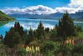
| 01/09/2003 06:42:36 AM | Lake Genesisby MagsCoyoteComment: Critique Club Comment :o)
Composition:
This shot was probably taken perfectly level, but the change of colour to the water in the background means that the far bank is exaggerated, making it seem as though the shot has been rotated too much. Again, this feeling is emphasised by the reflection of the lefthand side bank in the water. The flowers in the foreground are nice, but the centre of the shot is taken up by the very dark trees, which overpowers the foreground.
Background:
This is a beautiful location, but to me the background to the shot (the lake/river, the mountains, and the sky) is more interesting than the foreground :o)
Camera Work:
Since the shot was done at ISO 80, I can only assume that the grainyness of it is due to the high compression / post processing. The focus of the shot feels slightly off too, as though this is a photograph of a reflection rather than of the real thing - easily corrected by sharpening in post-processing.
Post-Processing:
Since you've not provided any details, I can only guess at any post-processing work that you have done. The image has been saved to only 71Kb, which is less than half the maximum size - you should always try to get as close to 150Kb as possible, since you lose more detail to the compression the smaller the file is. Another suggestion (apart from those listed above) would be to adjust the levels and colour balance, as the colours of the foreground flowers are quite pale, yet the blues and greens are very bold, almost unreal.
My Opinion:
Like some other photos in this challenge, this one to me signifies a travel destination rather than travel itself. The (misleading) feeling of offcentre rotation, combined with the grainy sky and odd colours, really pulls this shot down, which is a shame, since its a really beautiful location.
If you have any questions about this critique, please feel free to PM me about it. |
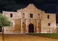
| 01/09/2003 06:20:11 AM | Remember the Alamoby bstewartComment: Critique Club Comment :o)
Composition:
The building itself is reasonably clear, but the tree on the left is quite distracting, especially since its obscuring one of the windows - taking the shot a tiny bit more to the right would really have helped.
Background:
The night sky makes the top part of this shot seem very flat, almost making the building seem like a backdrop to a movie set, which both works for and against this shot. The foreground path and paving lead the eye in a bit, but to me they seem to lead my eye to the tree :o)
Camera Work:
The DoF on this shot is very deep, keeping everything in focus. Obviously you didn't light this yourself, but perhaps shooting from a position over to the right more would help make the lights there work for you more, lessening the impact of the shadows.
Post-Processing:
Since you've not provided any details, I can only guess at any post-processing work that you have done. The colour balance on this shot is very orangey, probably due to the lighting there as much as anything - perhaps adjusting the levels to make the shot more white would help exaggerate the contrast between the building and the night sky.
My Opinion:
This is a reasonable shot, but with several minor distractions. As for whether a photo of the Alamo can signify "Travel" or not I'm not sure - I personally would class this as a travel destination rather than travel itself, which may be why this shot didn't score as highly as it could have done.
If you have any questions about this critique, please feel free to PM me about it. |
| 01/09/2003 05:55:49 AM | Stayed Homeby mcraelComment: Critique Club Comment :o)
Composition:
The vehicle fills the frame, which means there's no ambiguity as to what the subject is! I have two suggestions though - rotating the image a degree or two clockwise would help balance out the angles, as it feels slightly slumped to the lefthand side currently (if the vehicle really does slump like that, it may have been best to use a different camera position to help emphasise it). My other suggestion would have been to flip the image left<->right, so that the lines of the side of the vehicle lead the eye from the top-left corner down to its front. However, doing so would mean that the licence plate would be backwards, so perhaps you'd have to take this shot from the other side of it.
Background:
Since the vehicle dominates the frame, there is very little background to this shot, but what little there is helps provide context to the image (ie everything's snow-covered), yet it doesn't distract from the subject itself, which is ideal.... but perhaps cropping the righthand side a little would help make a cleaner edge there.
Camera Work:
I've already mentioned two possible other positions from which you could have shot this, but perhaps a higher angle shot, looking down on the vehicle a bit more would have helped, since that would show more of the snow on the roof etc. Other than that, the focus on this shot is excellent, and the DoF is very deep, so that the entire vehicle (and most of the background) is very clear.
Post-Processing:
Since you've provided no details, I can only guess at your post-processing, which I'd guess included focus sharpening. My one suggestion would be to play with the levels, and try to create brighter, less muted colours (which appeal more to the "normal" dpc voter). The alternative would be to really desaturate the shot, and wash the colours out more, so that it'd emphasise the cold & abandonment.
My Opinion:
This shot definitely meets the challenge, but I feel it lacks anything that really holds my interest, making it an "average" photo. But that's just me :o)
If you have any questions about this critique, please feel free to PM me about it. | | Photographer found comment helpful. |
| 12/12/2002 07:18:53 PM | The Blue Leanieby ManicComment: Thanks for the critiques folks :o) A few responses:
Like I mentioned in my previous comment, I couldn't crop any lower due to a streetlamp being just below the shot (and its right next to the building, so nearly impossible to avoid without spoteditting). I even used the 640x427 ratio to get more of the building in view, but really needed the new unrestricted aspect ratios of dpc2...
The colours are a bit oversaturated, as I was trying to bring out the blues of the glass, but the bricks really are close to that shade of redish-orange. The jaggies are mostly the result of having to meet the 150k compression, plus theyre one of the known weakness of the camera.
What I was really trying to achieve with this building was a shot similar to this shot which I'd taken a few months previously, but I wasn't able to get the same angle nor lighting as before.
Oh, and I've heard of Beckley, but I've not been (or been through) there I don't think :o) Message edited by author 2002-12-12 19:19:49. |
Home -
Challenges -
Community -
League -
Photos -
Cameras -
Lenses -
Learn -
Help -
Terms of Use -
Privacy -
Top ^
DPChallenge, and website content and design, Copyright © 2001-2025 Challenging Technologies, LLC.
All digital photo copyrights belong to the photographers and may not be used without permission.
Current Server Time: 08/21/2025 08:40:44 AM EDT.
|