Critique Club Comment :o)
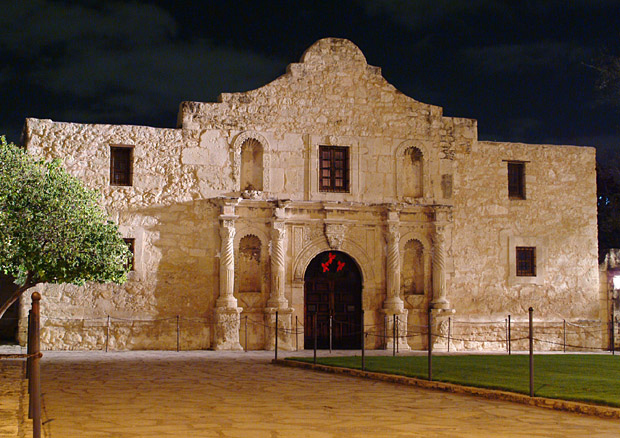
Composition:
The building itself is reasonably clear, but the tree on the left is quite distracting, especially since its obscuring one of the windows - taking the shot a tiny bit more to the right would really have helped.
Background:
The night sky makes the top part of this shot seem very flat, almost making the building seem like a backdrop to a movie set, which both works for and against this shot. The foreground path and paving lead the eye in a bit, but to me they seem to lead my eye to the tree :o)
Camera Work:
The DoF on this shot is very deep, keeping everything in focus. Obviously you didn't light this yourself, but perhaps shooting from a position over to the right more would help make the lights there work for you more, lessening the impact of the shadows.
Post-Processing:
Since you've not provided any details, I can only guess at any post-processing work that you have done. The colour balance on this shot is very orangey, probably due to the lighting there as much as anything - perhaps adjusting the levels to make the shot more white would help exaggerate the contrast between the building and the night sky.
My Opinion:
This is a reasonable shot, but with several minor distractions. As for whether a photo of the Alamo can signify "Travel" or not I'm not sure - I personally would class this as a travel destination rather than travel itself, which may be why this shot didn't score as highly as it could have done.
If you have any questions about this critique, please feel free to PM me about it. |