| Image |
Comment |
| 12/02/2002 09:06:00 PM |
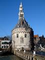
Council sells 1532 defence tower (local frontpage)by AzrifelComment: (1) COMPOSITION (CONTENT) - I really like the tower. Historic location, and something that probably should not be sold. However, the photo would have a lot more impact if it were not so centered. There are some excellent buildings on the right, and probably on the left, along with a boat. I think I would like to see more of the buildings on the right, so move the tower to the left center of the photo. (2) BACKGROUND � Just a great blue sky; beautifully sets off the tower. (3) CAMERA WORK ,TECHNICAL � Great focus and DOF. (4) DIGITAL PROCESSING ,TECHNICAL � No recommended changes. (5) MY OPINION ON THE PHOTO � When I first looked at the photo, I knew it was in the Netherlands, and I liked it; brilliant blue sky sets off the tower. I think a title that indicated what it was sold for ( or to) would have strengthened the entry for the challenge. The viewer is left wondering � will it be knocked down ? turned into a restaurant? Jim msp Critique Club |
 Photographer found comment helpful. Photographer found comment helpful. |
| 11/29/2002 08:14:00 PM |
|
| Photographer found comment helpful. |
| 11/29/2002 08:11:00 PM |
Out of the Ashesby PtmanComment: Good photo. I like the contrast of green grass & blackened trees. Brown leaves bother me a little with your title. 8 Jim msp |
| 11/26/2002 09:46:00 PM |
|
| 11/26/2002 10:01:00 PM |
Flowerby Title9Comment: Looks way out of focus - probably caused by too small a crop. I can see the pixels. Not cover worthy. Jim msp |
| 11/26/2002 10:26:00 PM |
First Contactby PifflefishComment: Flash reflection in center ruins the attemp. I would accept the blur for the goal you want to achieve. Angle also confuses me. You seem to be looking down, but stars show at top. Jim msp |
| 11/26/2002 10:39:00 PM |
|
| 11/26/2002 10:11:00 PM |
|
| 11/26/2002 10:04:00 PM |
Aflameby n_ravikiranComment: Looks over exposed at top-center, out of focus most everywhere else. Also not sure what would be news worthy. Jim msp |
| 11/26/2002 09:57:00 PM |
Electric Blueby jclark20001Comment: Very confusing to me. A decent photo of something, but what? I'm having problems with a story, never mind which page. Jim msp |
Home -
Challenges -
Community -
League -
Photos -
Cameras -
Lenses -
Learn -
Help -
Terms of Use -
Privacy -
Top ^
DPChallenge, and website content and design, Copyright © 2001-2025 Challenging Technologies, LLC.
All digital photo copyrights belong to the photographers and may not be used without permission.
Current Server Time: 08/20/2025 02:03:50 PM EDT.