| Image |
Comment |
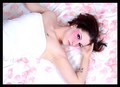
| 02/27/2006 11:38:19 AM |
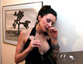
Coke Whoreby PhotiquesComment: Sorry this didn't do better. It got a five from me because it was an original idea and I liked almost candid feel. I think I would have scored it higher if it were in black and white. I think what mostly held me back was that it hasn't quite lost the feel of a set-up shot and this type of photography needs to look really raw and candid,IMO. This is just a little too clean. I just looked through a huge book of candid photos from the 80's by this one photographer and this is just the sort of thing that was in there, only his were black and white and generally grainy. Actually, many of his shots would have tanked in a DPC challenge...;D. I wish I could rememember the name of the book or at least the photographer.
Anyway, it's nice to see a fresh perspective. I'm wishing I went back and re-thunk my scoring for this. Sometimes I do that if I have time to review my voting pages. |
 Photographer found comment helpful. Photographer found comment helpful. |
| 02/25/2006 10:38:05 AM |
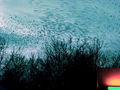
THE BIRDS!by melismaticaComment:
Thanks for sharing that...After reading the photographer's description of how he got the shot (two-fisted photography--jeesh!) I feel better about how my turned out. I wasn't planning on taking any photos. I actually pulled over in my car to get the shot. It was really difficult because the move so bloody fast and the camera I have is practically a toy compared to what a lot of folks use on this site these days.
My daughter and I had to dodge a rain of birdshit too. That was something I didn't consider when I got out of the car. Miraculously, we were unharmed. |
| 02/25/2006 01:11:08 AM |
|
| Photographer found comment helpful. |
| 02/25/2006 12:17:52 AM |
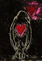
Crow IIIby melismaticaComment: Edited to remove accidental re-posting.Message edited by author 2006-02-25 00:19:48. |
| 02/25/2006 12:17:18 AM |
Crow IIIby melismaticaComment: Originally posted by saintaugust:
i really like this. art/photography together. artography. |
Actually, there isn't any photography in this piece. :D It's a playing card that I drew over with oil pastel and then scratched into. The heart is part of the card and I used that as a design element. |
| 02/24/2006 07:52:42 PM |
Crow IIIby melismaticaComment: Originally posted by Jutilda:
Oh this is very cool. Did you do the drawing??? |
Yes. I gave the card several layers of oil pastel and scratched and rubbed into it to reveal the white of the card. I used the red heart of the playing card as a design element. When I had the drawing done I added more layers of color with the pastels. |
| 02/24/2006 07:18:48 PM |
|
| Photographer found comment helpful. |
| 02/24/2006 07:16:35 PM |
Modoby tjmuellerComment: Eek! The skin tone of her face doesn't match the rest of her. Her hand near her face is several shades lighter! Very unappealing. Someone overdid it on the pancake or the bronzer. This looks like a boudoir photo. I can't really imagine this in a fashion magazine. Maybe Fredericks of Hollywood? |
| Photographer found comment helpful. |
| 02/24/2006 07:13:53 PM |
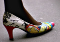
Make Your Own Way Thereby xXxscarletxXxComment: This doesn't have the feel of a fashion editorial to me. I can't recall the last time I saw selective desaturation in a fashion spread (if ever). There are a lot of artifacts in this image, particularly around her arm, the belt and her face. She's a cute model though. |
| Photographer found comment helpful. |
| 02/24/2006 07:08:45 PM |
|
Home -
Challenges -
Community -
League -
Photos -
Cameras -
Lenses -
Learn -
Help -
Terms of Use -
Privacy -
Top ^
DPChallenge, and website content and design, Copyright © 2001-2025 Challenging Technologies, LLC.
All digital photo copyrights belong to the photographers and may not be used without permission.
Current Server Time: 08/25/2025 11:13:59 AM EDT.